Introduction :
This is an article dedicated to the Gmic filter'colorize', a new and next generation computer-assisted tool for colorization image filter.
This filter was created by David Tschumperlé , project manager and main developer of Gmic.
The filter improved a lot on this September 2014 ( and was started around spring 2013 ). I kept an eye on the filter development since the very beginning as a tester, but I got totally enthusiast about it recently ; especially when filter became interactive and more user friendly.
I ) Overview
1) What kind of problems it solves :
A bit of context here, the first steps of colorizing a line-art, usually with flat zone is a super
long, annoying and robotic work.
How artist usually handle this task :
- Brush : simply take a brush and fill manually the color
(a.)- Fill Bucket : use a fill bucket tool and click the area, then correct with brush
(b.)- Of course, both methods (often used together) introduce
quality problems(c.) ![]()
A lot of artist find with time their own recipes to reduce this step. Also digital-painting software proposes set of features to make the life of artist less difficult : auto-enlarge fill bucket result, gap detection for fill bucket, better selection tools, filter to fill every zones with random colors ...etc...
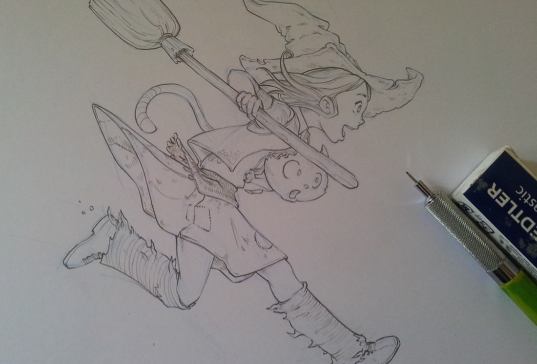
Here I'm used to the brush method (a.). It's might not look obvious on the size of the little 'grumpy unicorn drawing' here, but I'm sure you can imagine the long time it represents repeating this on a lot of comic pages. Not surprising that even on the comic industry, 'preparing page with flat color zone' is even a job, and a full-time-working position.
2) Gmic filter solution :
Gmic 'colorize' filter works a bit like a
smart fill bucket tools on steroïd , it's really
interactive, and the previous boring task with bad results become suddenly a fun part of the job with a
clean result.
How it works :
- Feed Gmic with a lineart ( eg. a b&w picture )
- Select colors and place color markers/tokens on the picture ( you can move them or delete them too )
- At any moment press <Space> to update the rendering and gmic will smartly fill the colors detecting edges
(d.) - Place more markers until the result is good and keep press <space> to update.
- Press Enter at the end ; Gmic will export a color map image as a result.
(e.)Note : Gmic fills the gaps and don't care if the line are transparent, or sketchy.
It's very fast to do.
3) The result :
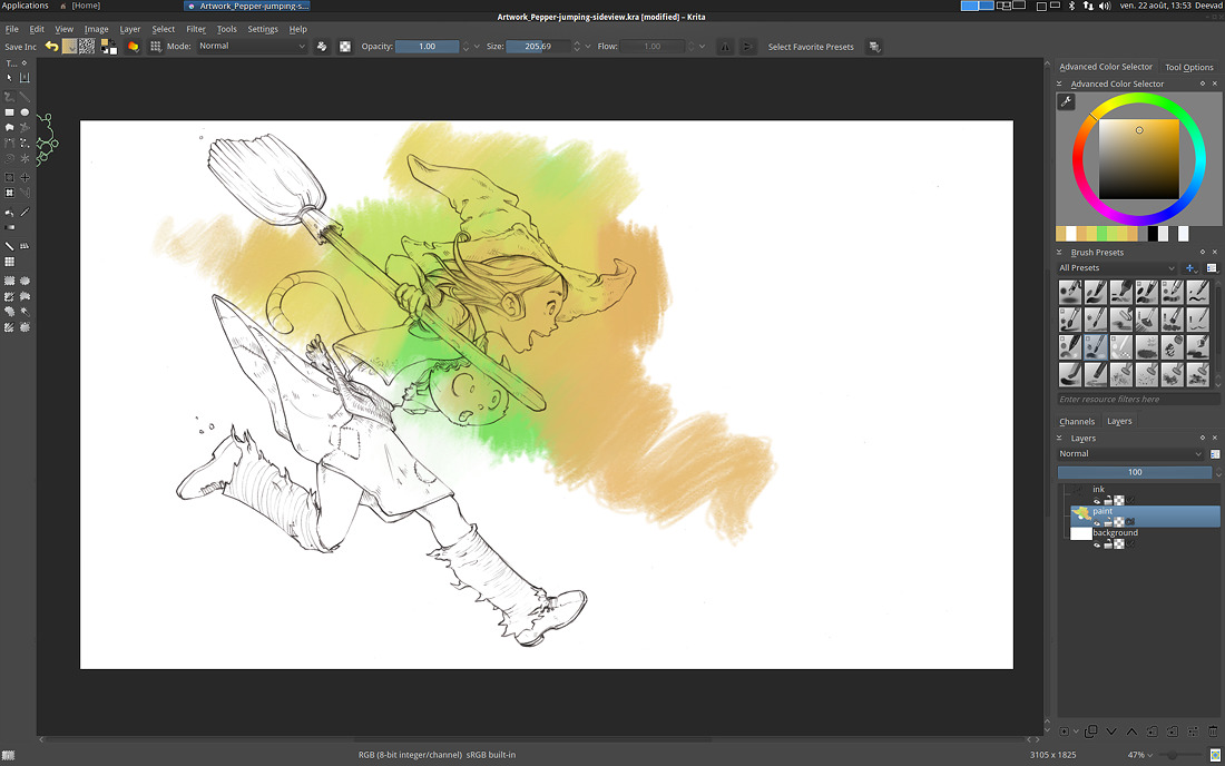
In Krita ( my favorite digital-painting software ) open your line-art and import your color map ( drag and drop the file over the canvas, or in
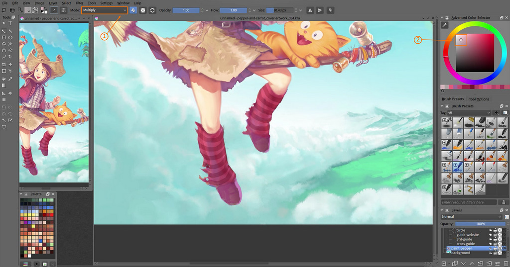
Menu>Layer>New>Import Layer ); put your line-art on the top of your layer stack with the 'multiply' mode to test
(f.) . You might be amazed by how the color-map is
exact and clean ; even under transparent line-art(g.).
For sure, you 'll meet
minor issue here and there and will need to clean parts manually sometime, but the bigger part of the work is done for setting your flat zones, and it's done , again, very fast .
II ) Real example inside a workflow :
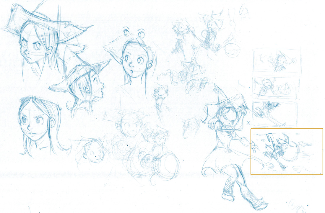
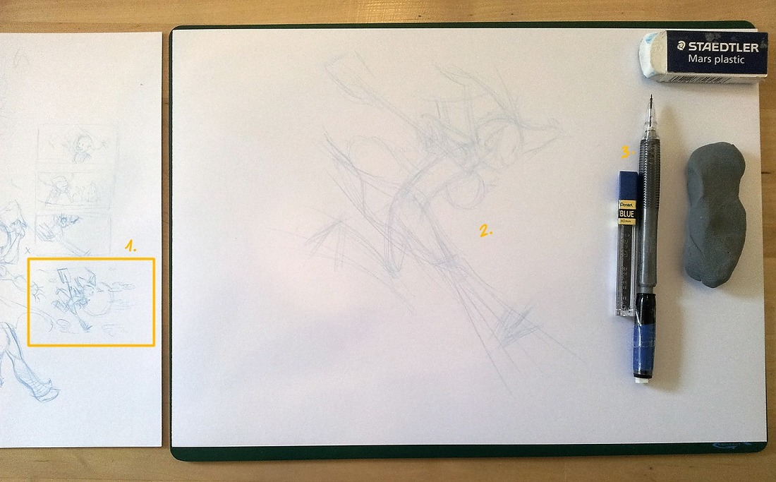
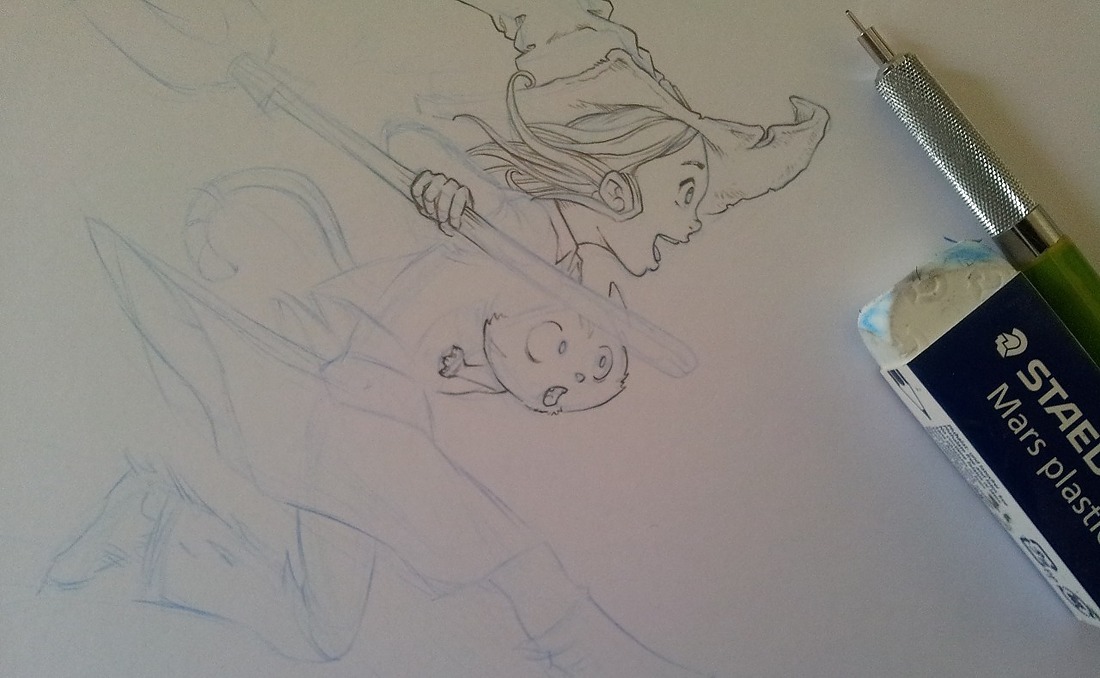
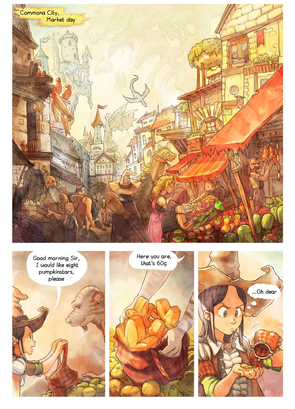
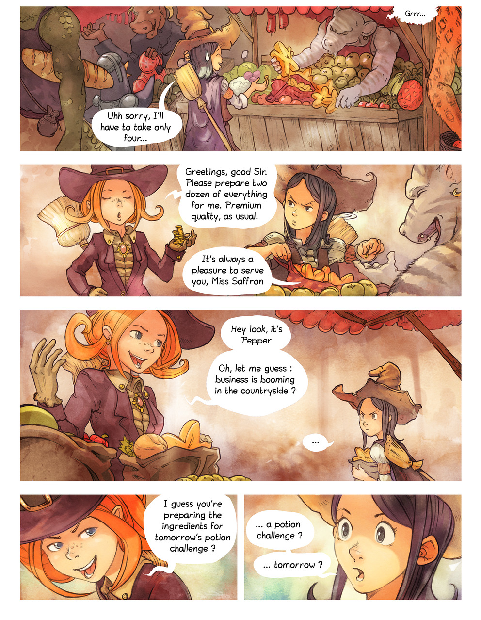
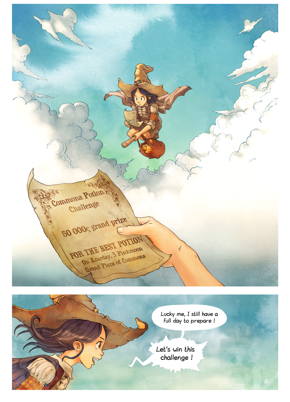
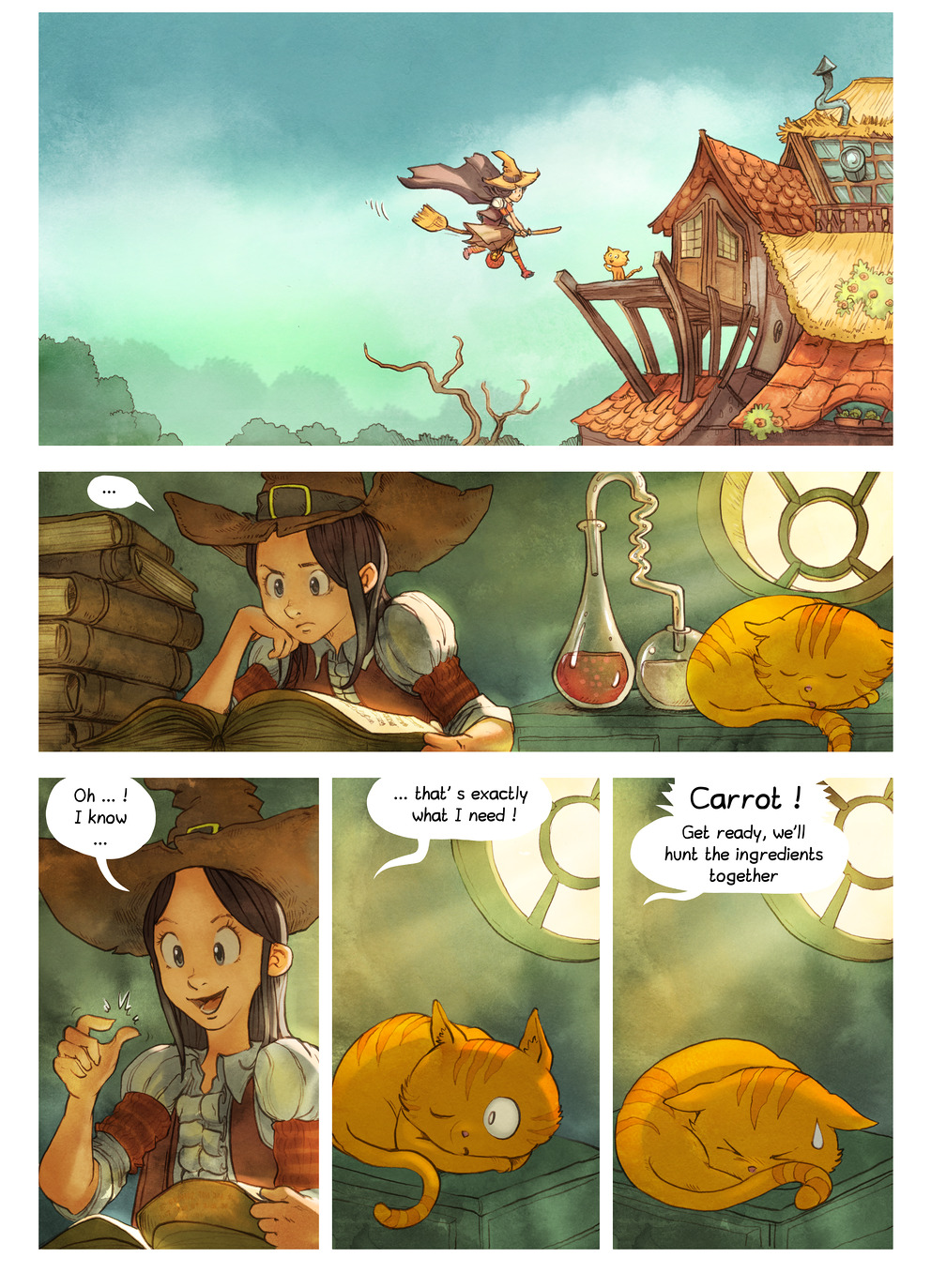
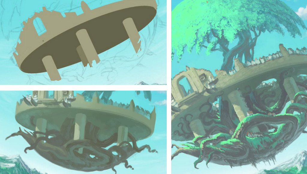
In the upcoming Pepper&Carrot ep.3, an
open webcomic I'm writing, I use the colorize filter to prepare my comic pages.
1) Setting area with clean edges
I don't use the filter 'colorize' to color all the little details. The filter is able to do this for sure, but for my usage I prefer to use it to obtain large groups of the same color.
![]() click to enlarge
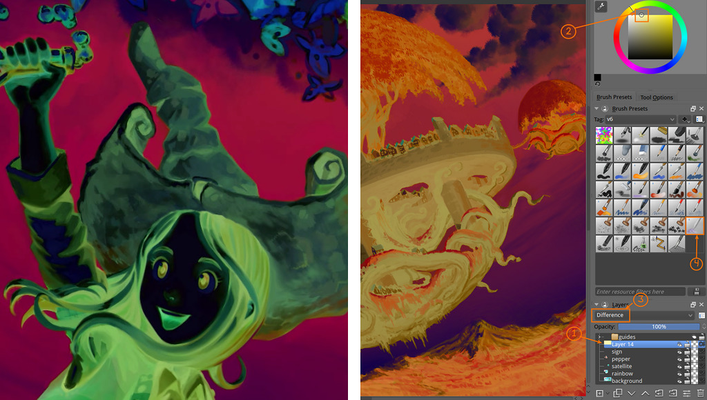
click to enlarge2) Import in Krita
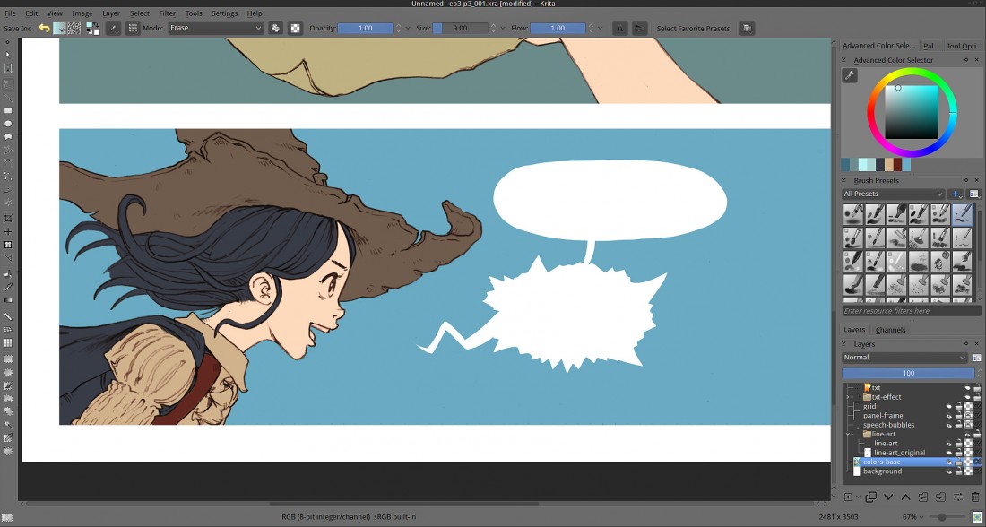
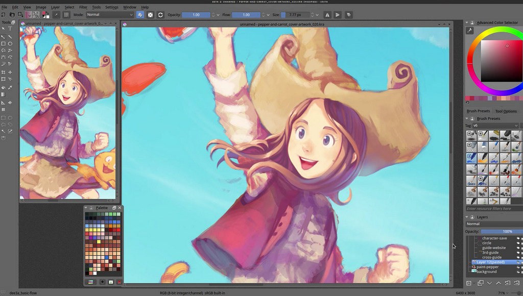
I reinject the colormap obtained by Gmic in my Krita *.kra files, and correct the areas if necessary. In this case, I had a glitch only on her hair ( still visible on the screenshot ) ; easy to correct.
![]() click to enlarge
click to enlarge3) Painting within the limits of selected areas
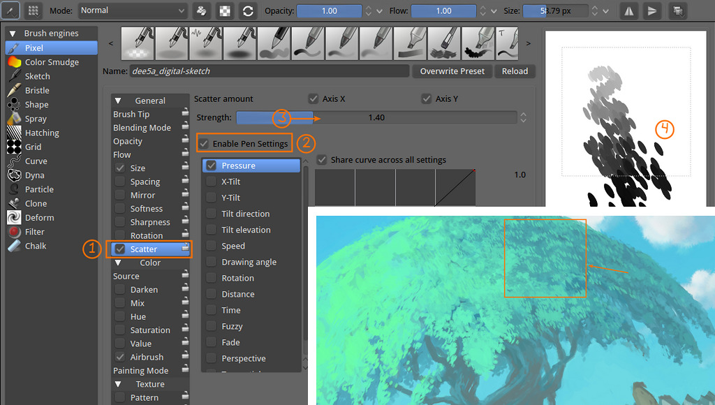
Real fun start here; I keep the layer with Gmic result on the bottom of my stack and use it as a color-selector layer ; I use "magic wand" on it to select area of colors. Within this selections, I can paint freely while keeping really clean edges. It's really convenient for my style, because I like soft shading, and not shading with only hard edges as often used on comic, cartoon and anime.
![]() click to enlarge
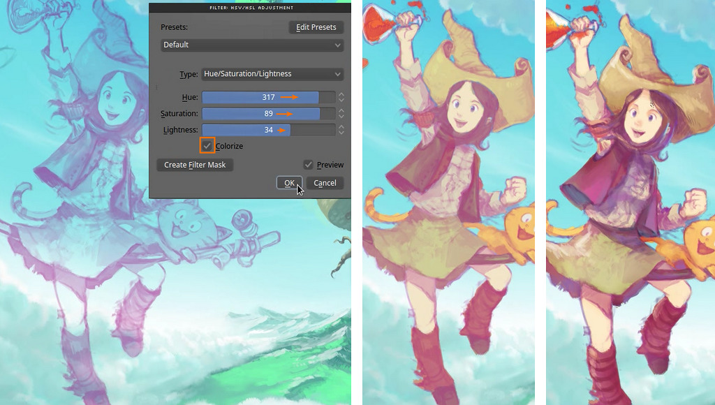
click to enlarge4) Post-production effects
I add a color-grading pass using often the adjustment curves, color-balance, and contrast/brightness curve.
Final touch is to texture my result for the watercolor effect.
![]() click to enlarge
click to enlargeIII ) Install notes :
This filter is very recent in September 2014 and still beta.
Package for mac, windows and Linux are available here on sourceforge on the sourceforge of the Gmic project.
If you have already a version of Gmic better than 1.6.1 , then you don't need to install anything. Just refresh the filter database.
This installation will install the gimp_gmic plugin as well.
notes for 'buntu Linux 14.04 , 64bit:
You'll need
libtiff4_3.9.7-2ubuntu1_amd64.deb , required dependencie,
available here (from older repo).
I installed
gmic_1.6.*_beta_amd64.deb available
here on sourceforge.
IV ) Usage via Gimp-Gmic plugin
You'll need Gimp 2.8 installed, and the Gmic beta plugin.
1. Open
Open with Gimp your Line art
![]() click to enlarge
click to enlarge2. Call the Gmic filter dialog
The filter can be found on regular installation under the menu Filters > G'MIC
![]() click to enlarge
click to enlarge3. Find and setup the filter
Note : refresh your filter database ( press the button of a circular arrow at the bottom of the 'Available filters' list. it's between a '+' button to add the filter to your favorites, and a checkbox with 'internet' label, to benefit from the additional Internet filters update )This is the harder part ; Select under the categories 'Black&White'
(1.) the filter 'Colorize[interactive]'
(2.) ; then on the right side, setup
(3.) :
- Input type : Lineart
( we choose 'Lineart' here , exept if you want to recolorize an old black&white photo )- Output type : Original image + color-only layer
( to get two resulting layers )- View resolution : Choose a setting depending your hardware performance , this will affect the preview refresh time, and preview quality.
- Palettes : optionnal ; select on disk a palette ( *.gpl format )
Then when ready, press Ok
(4.)click to enlarge
4. Gmic colorize interactive dialog
The dialog will appear on your desktop ( you'll probably need to reorganize the windows a bit to be more comfortable ).
Mini how to use :You can start to take a color from the palette , and place your markers on the canvas
Press
<space> to update the filter, do it often.
Usefull :
right click on a marker to delete it ; and
right-click on a color on canvas to color-pick it.
When the work is done, press
<Enter>click to enlarge
Here are all the list of the keyboard commands so far : -
Left mouse button creates a new colored control point (or moves an existing one).
-
Right mouse button over a control point deletes it.
-
Right mouse button anywhere else picks a color from the image.
-
Mouse wheel, or keys 'CTRL+arrows UP/DOWN' zoom view in/out.
-
'CTRL+mouse wheel', 'SHIFT+mouse wheel' or arrow keys move image in zoomed view.
-
Key 'SPACE' updates the extrapolated color field.
-
Key 'TAB' switches between markers view modes.
-
Key 'BACKSPACE' deletes the last control point added.
-
Key 'PAGE UP' increases image contrast.
-
Key 'PAGE DOWN' decreases image contrast.
-
Keys 'CTRL+D' increase window size.
-
Keys 'CTRL+C' decrease window size.
-
Keys 'CTRL+R' reset window size.
-
Keys 'ESC', 'Q' or 'ENTER' exit the interactive window.
5. Back in Gimp
When you press
<enter> the filter will export in your Gimp layer stack 2 layers ; the original line and the color-map.
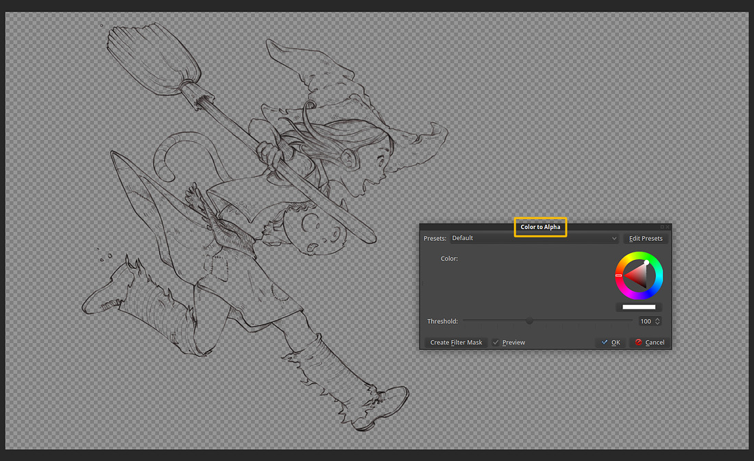
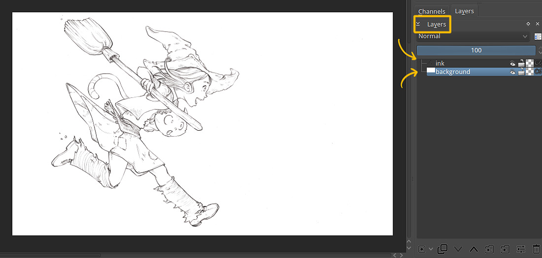
You can then place your lines on the top
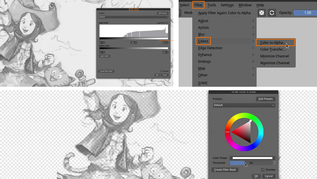
(1.) and set the blending mode to multiply
(2.) ( or using the Color > Color to Alpha to remove the white part of the image )
Just export this as a *.ora ( open raster ) if you want to continue to work your color on Krita or Mypaint :)
![]() click to enlarge
click to enlargeThat's all :-)
V ) Usage : command line style :
Start to update the filter , in a terminal :
gmic -update
... to update and download all the recent filters. That's it. You have Gmic beta with last filters.
You can then launch Gmic 'colorize' filter this way :
Save your lineart in a folder ( eg. lineart.png ) and open a terminal into this folder, and copy or adapt :
gmic lineart.png -x_colorize 1,1024,1 -s c,{3-s} -o[-1] colors.pngHere is another variant if you save also in this folder a palette.gpl file to get an additional palette dialog.
gmic linear.png -input_gpl palette.gpl -x_colorize[0] 1,1024,1,[-1] -k[0] -s c,{3-s} -o[1] colors.pngIt will open a canvas with your artwork, and under or around a dialog with the palette.
The terminal will write you how to use the filter, and command to use. ( screenshot under )
![]() a Terminal windows , after a Gmic colorize filter done from command line
a Terminal windows , after a Gmic colorize filter done from command line
That's it, have a good coloring time
VI ) Usage : video demo
Here is a demo video, by David Tschumperlé over a Pepper&Carrot line-art :-)
Conclusion :
I saw so many comic artist compromising their own line-art style by making all the area closed, all the lines pure black, etc... What's the meaning of all of that ? optimize the artwork to use non efficient tools as the fill-bucket? Yes. Most of line-art artworks are still under the slavery of outdated tools constrains. And most artist prefer change their own style for something more synthetic, robotic and predictable in order to win a bunch of painful hours of work. I don't blame, and I totally understand as I tried myself during many years to ink this way, to optimize my own workflow to make the fill-bucket tool easier to use. But I couldn't use pure black lines, use only big simple shapes and close all my line gaps ; I like the feeling to ink my comics with pencil , and my lines are full of grays shades, and I don't close always my lines and shapes. I even like to crosshatch a bit, and detail texture with messy lines here and there. A nightmare to colorize...
But a filter like the Gmic 'colorize' is really bringing on the table an innovating answer to the problem. This will really improve my productivity, and the quality of my artworks as I can now invest more time on the shading and post-production. I even think it will help me to make more spontaneous pencil artworks, get more relax and ink more freely ; because I know they'll be simple to color...
Next step ? Getting this directly plugged into the filter menu of Krita ? :-)
Many thanks to David Tschumperlé for all his work on Gmic,
and many thanks to Timothée GIET too for all the test he also made of this very cool tool.
License :
This article and example ( including Pepper&Carrot artworks ) is licensed under a
Creative Commons Attribution 3.0 Unported License.
This tutorial is indirectly sponsored by my Patreons.
Join them if you want to support me into the creation of free webcomics, free tutorials with cool license :-)
![Creative Commons License]()