Quantcast
Channel: David Revoy
Viewing all 526 articles
Browse latest View live

Shading tutorial for comics

$
0
0

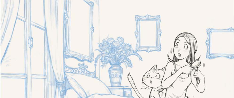
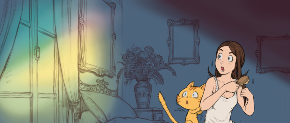
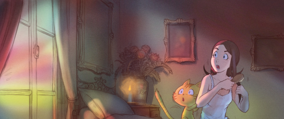
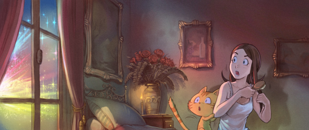
This is a tutorial about my precious 'single layer shading' technique I invented while doing research on Pepper&Carrot. I explain how to setup the layer stack around the 'Hard Light' blending mode, how to use the inherit alpha and how to fill the layer with a mid-gray value (mid-gray is equal to fully transparant for Hard Light). I then demo the flexibility of this rigg by shading side by side three time the same character over various backgrounds with different ambiants (a night scene, a sunlight scene and a scene inside a forest)...

Attribution:
Video and artworks by David Revoy
Musics:
- (Timelapse) "Perspective" by Kevin McLeodhttp://www.incompetech.com / (CC-By)
- (Intro) "New Age B" by Frank Nora (Public Domain)

Tools:
Edited with Kdenlive 18.12appimage on GNU/Linux Kubuntu 18.04. I'm using Krita 4.1.5appimage on the video with a Cintiq13HD. Microphone: a Samson Meteor condenser. Webcam: a Logitech Pro C920. Recording software OBS studio (from ppa).

You can find (soon) also this tutorial on Peertube: https://peertube.touhoppai.moe/.

Cintiqs on GNU/Linux: How to setup brightness, contrast and more.

$
0
0
Last month, during a discussion on Twitter with the GNU/Linux artist Tyson Tan, Neotheta and  Wacom Official, I started to talk about the impossibility for GNU/Linux users to setup the brightness/contrast/RGB on their Cintiqs. And during this discussion Jason Gerecke -maintainer of the Linuxwacom driver- wrote a solution to this issue. Today, I'm reporting this solution on this article for better archiving and in the hope it will help future GNU/Linux artists at finding a solution to their problem.

About the issue:

Cintiqs are tablets made by Wacom with a display monitor built inside the surface of the pen tablet. In my carreer, I owned four Cintiqs. If you want to read my opinions about this tablets, read my full tablet history log article here. On the older models, the monitor had physical buttons to setup the brightness/contrast/RGB, something similar to many common monitors on the market. But around 2010, Wacom replaced the buttons by a driver (a software available only for  Windows and Mac). That's why I never could manage to change the brightness and the contrast of my hardware. I had to use the default factory setting but this one was unfortunately too dark by default.

Install:

You need to open a terminal and install ddcutil. On my Kubuntu operating system, I install it with this line:
sudo apt install ddcutil
(Note: if you are new on GNU/Linux, use Ctrl+Shift+V to paste inside a terminal)

Getting the identifier of your Cintiq:

sudo modprobe i2c-dev
then
sudo ddcutil detect
Thanks to this two commands, you can list and get the identifier of the detected hardware by ddcutil. Unfortunately this two commands crashes my computer and freeze the display. I have to hard reboot holding the power button six seconds each time I'm using them. But the display freeze after printing the result on the screen and you'll have to run this commands only once to know your identifier. In my case, my Cintiq has a three letter capitalized identifier: WAC.

Listing the available settings:

sudo ddcutil --mfg=WAC capabilities
This command will list all the capabilities of the 'WAC' device (screenshot under). Each capabilities are identified by a number (eg. Brightness is number 10). 


Screenshot: Konsole, listing the capabilities of my Cintiq13HD.

Knowing the current value of a setting:

To know the current intensity value of the brightness, you have to use 'getvcp 10' with this line:
sudo ddcutil --mfg=WAC getvcp 10
This command line output looks like that:
VCP code 0x10 (Brightness): current value = 50, max value = 100

Changing the value of a setting

Now if I want to switch the value of the brightness to 75%, I have to use 'setvcp 10' followed by 75:
sudo ddcutil --mfg=WAC setvcp 10 75

All other capabilities can be changed using setvcp. To change the color preset (14) to option 5 (6500K):
sudo ddcutil --mfg=WAC setvcp 14 05

Conclusion:

Thanks to this control on the brightness/contrast/RGB of my Cintiq, I was able to match the same luminous intensity in cd/m² as my other monitors. I was also finally able to calibrate the Cintiq to sync with the colors of my other monitors. I also discovered it was possible to draw on this device during the day without having to close the windows and set my workplace into the dark. It was long, tedious to setup this device via the command line but it was possible. This totally made me focus back on digital drawing using this hardware. Thank you again Jason Gerecke for sharing this solution and obviously not thank you Wacom for publishing only drivers for Mac and Windows on your website. This story is just another proof that being an artist on GNU/Linux requires a lot of knowledge... or you might spend years of your life painting in the darkness (as I did).

Production report: Pepper&Beetroot, the dog refactor

$
0
0
On the bug report of the free/libre and open-source webcomic project Pepper&Carrot, we had this long standing bug around: "Issue #06: Having a cat is too cliché for a witch". As the author and maintainer, it was very hard for me to accept this issue and I tried at first to protect Carrot. But after long debates and interesting arguments with the community, the idea grew in me and I decided to refactor the project and replace Carrot in every panels for a dog. We named him Beetroot and I designed him to not be too cute (to also avoid the cliché of the "cute pet dog") and his colors were inspired directly by the beetroots.

The refactoring started last week in the branch beetroot-refactor-all on Framagit and this project will take approximately four months to replace all appearance of Carrot for Beetroot. You can see the visual under of the first panels refactored. I hope you'll like him better than Carrot! Let me know in the comments bellow!


Spring open-movie: character design and concept-art

$
0
0

Spring: video of the full short movie (CC-By 4.0, blender.org)

At the end of 2017, I had the honnor to work for the Blender Foundation(again). They wanted to make another open-movie this time directed by Andy Goralczyk and named "Spring". For more introduction about how I met the project and how I worked with Andy; read this previous blog-post about our pre-production week together.

This afternoon was the premiere of Spring on Youtube (video on top) and that's why I wanted to make a new blog post to share it. Congratz to all the team of Spring for all the work done on all this period! Also, thank you to all subscriber on Blender Cloud who made this short financially possible by your subscription. Sources files, tutorials, making-of about Spring are bonuses for the Blender cloud subscriber here:https://cloud.blender.org/p/spring.

Full concept-art gallery:


The picture were painted using Krita and are linked to their full-resolution(click to enlarge). They are licensed under the license Creative Commons Attribution 4.0. (attribution to "David Revoy, blender.org").


The first speedpainting I did after reading the scenario.
You can see a video timelapse about this one here.


The pillar scene in the wood.


A paint-over one of the early 3D model.


Character design.


Full 2D color rendering of the character design.


Model-Sheet for Spring.


Model-Sheet for Autumn.


Expression sheet for Spring (A)


Expression sheet for Spring (B)


Concept canceled during production:

A scene of the movie was cut just before starting the production. It was an introduction scene about Spring waking-up in her house with her dog. But I made artworks about this parts because this scenes were still around when I was doing the concept art:


The house of Spring, the setup in the mountains and the waterfall of chime.


The interior of the house; for a wake-up scene.
Paint over a 3D model, you can a video of the process here.


Spring after wake-up discovering the winter in the valley


A first scene before an old Spring goes to sleep (before getting reborn).


Very first doodles and sketches(watercolor) of the wake-up scene

Back from JdLL in Lyon

$
0
0
Photo: Pierre-Yves Gosset (Director/Managing Director at Framasoft) and me at JdLL 2019.

A big thank you for all who came to meet me at JdLL in Lyon. Thank you for those who bought original drawings, for those who came with their albums, for the fan-arts I received (which I will publish soon) and for those who came to the conference today...

That was great!

Black Hole

Production report: episode 29, part 2

$
0
0
Here is the second production report about the future episode 29 of Pepper&Carrot, an insight into the work behind the scene of next episode. If you missed it, read the first production report.

Spoilers alert: I'll not reveal in this page any plot elements which threaten to give away important details about the story of the next episode. But, because I open all the process, if you follow the link on the Framagit discussion and thread, you'll access to the full story, storyboard, etc.

Tests

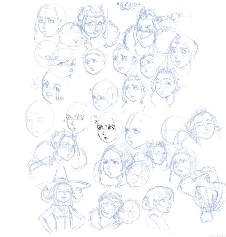
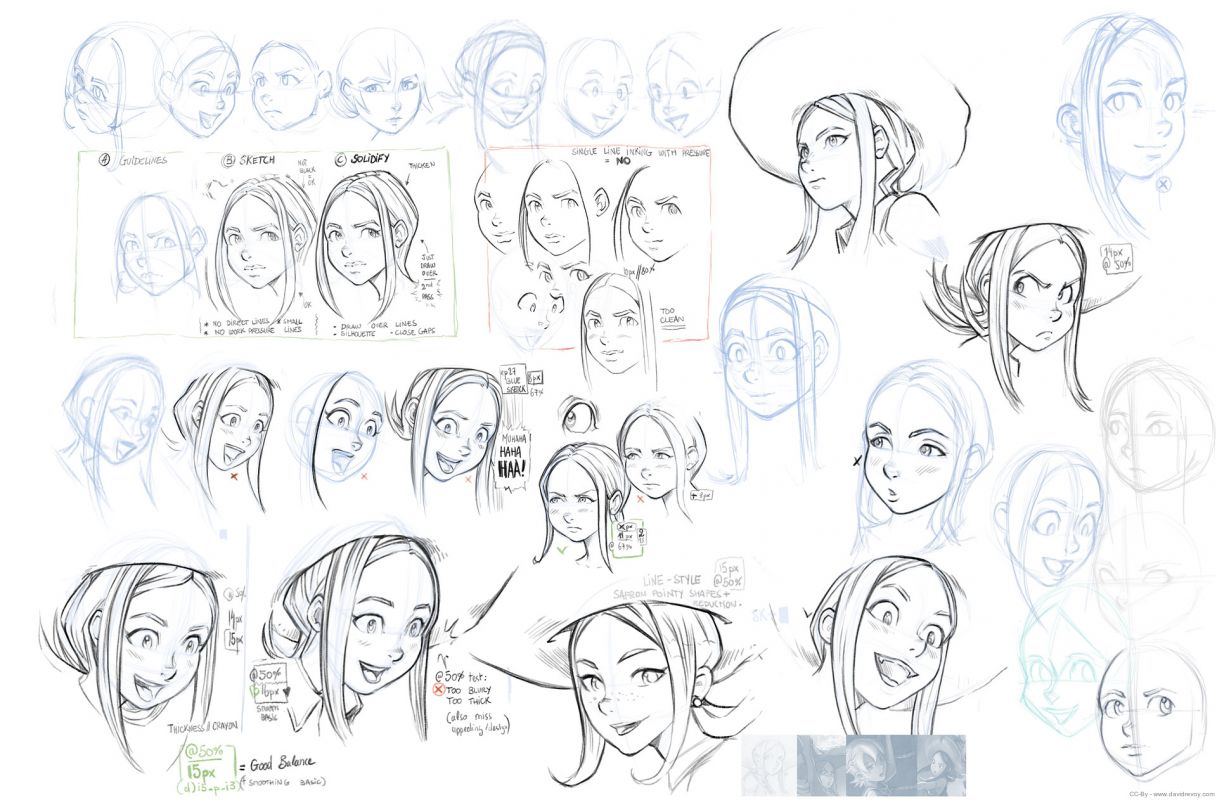
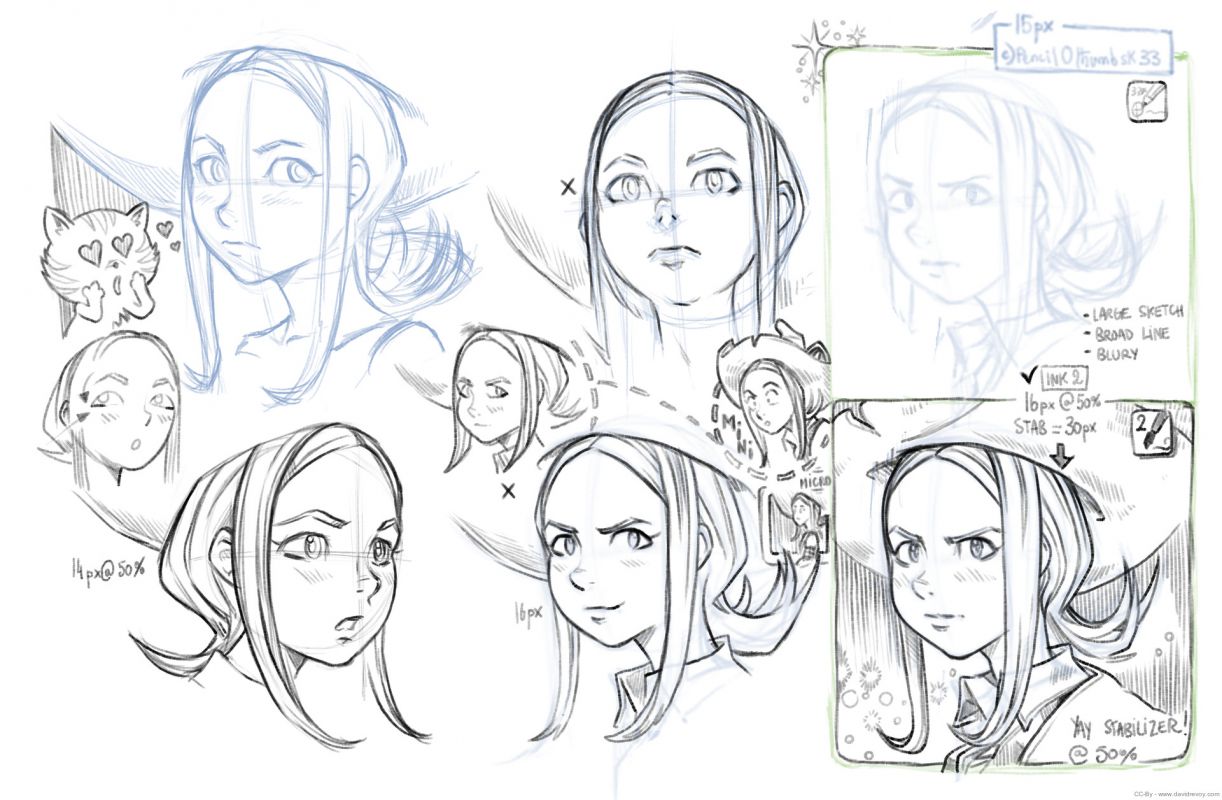
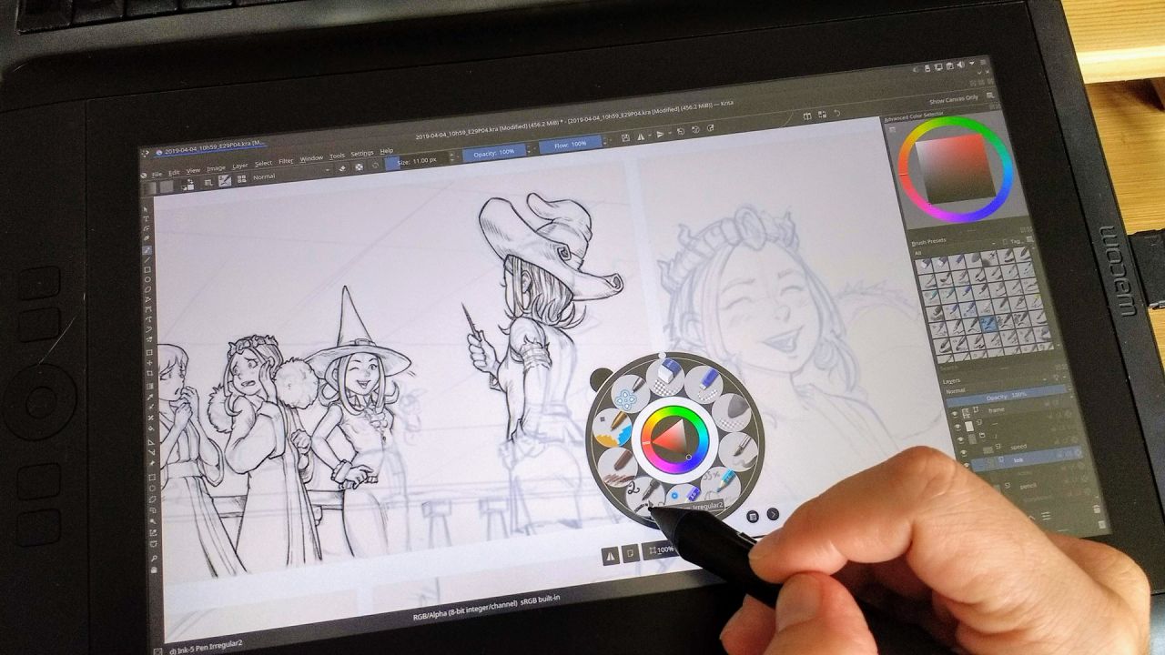
Just before starting the digital inking step for episode 29, I felt I had to upgrade my digital drawing skill in order to be better in sync with my brush presets, Krita and how respond the Cintiq13HD. So I decided to sketch while keeping the same presets and focus on various stylistic researches and constructions methods I wanted to explore. I noted on this researches the brush preset used, the diameter, the zoom of the viewport and if I use a stabilizer method or not until I felt I had something comfortable and predicable.


Test 1 - click to enlarge


Test 2 - click to enlarge


Test 3 - click to enlarge

The digital page size

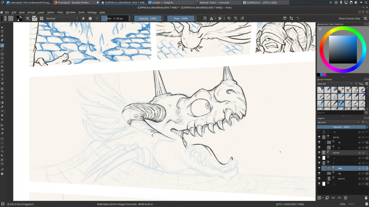
I also did researches to match as near as I could my traditional comic-page inking experience. My only previous experience with the Cintiq13HD and inking (read episode 23 Take a Chance making-of) wasn't good as I produced a too thin line-art and then I had issue at coloring... For my researches on episode 29, I found that at 50% zoom on my 2975x4200pixels large comic-page, I have a page that exactly matches my ideal traditional page size (something slightly lower than a A3 but bigger than a A4).But I inked most of the time the pages at 67% zoom of the viewport with a 11px large brush (you can find my inking preset on my duo brushkit). I drew on the 50% zoom only for close-up.


digital inking VS traditional inking : matching styles and widths.

A subtle background-color

A little tip I found on the way was just a background color; I was used to the light grey #C0C0C0 but it was also cold and sad. An easier one for my eyes to work on the Cintiq13HD was #F9F5EE. It also simplified working with the white borderless frames around the panels and the borderless speechbubbles.


While Inking blue digital pencil

Blue Pencil

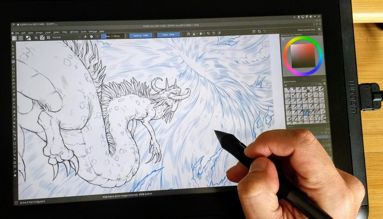
I used a blue #1871BB to do all the penciling. This blue has enough of contrast to draw with it and it was subtle enough when the opacity of the layer was reduced at around 25% to enjoy inking over it. I decided to keep all the backgrounds in blue-pencil only and ink in black only the characters. The background will receive a full paint-over pass and they don't need to get a really precise drawing line-art as the character did.


A panel with the character inked, and the background in blue pencil


While inking at 67% zoom of viewport


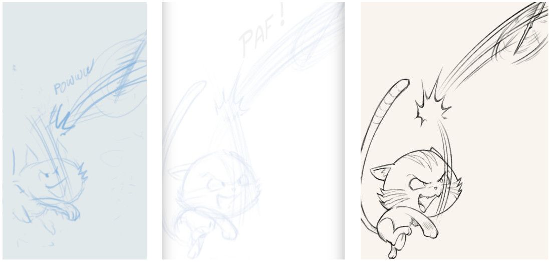
Three steps side by side: storyboard, pencil and inking

3D helpers

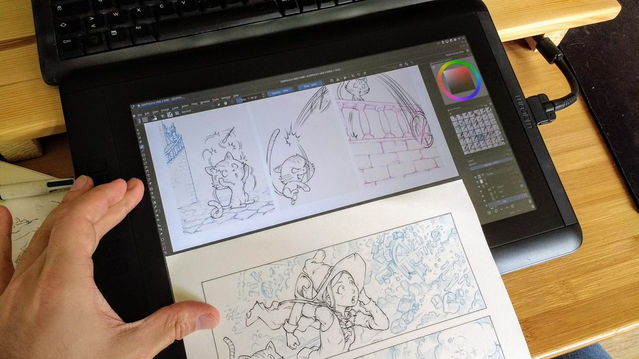
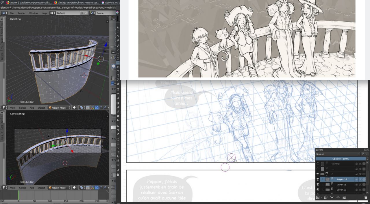
Sometime, it was too hard to draw curvy elements into perspective. My freehand attempts were looking too woobly. In that cases, I used Blender 3D to quickly model backgrounds elements. I then rendered them using Freestyle (a method to get 3D elements traced with lines) and I merged the render tinted in blue with my pencil layer. I kept inking manually over the render to get more life in the line. In episode 29, I used a lot 3D for backgrounds.


A shot using 3D elements

Coloring: the last step


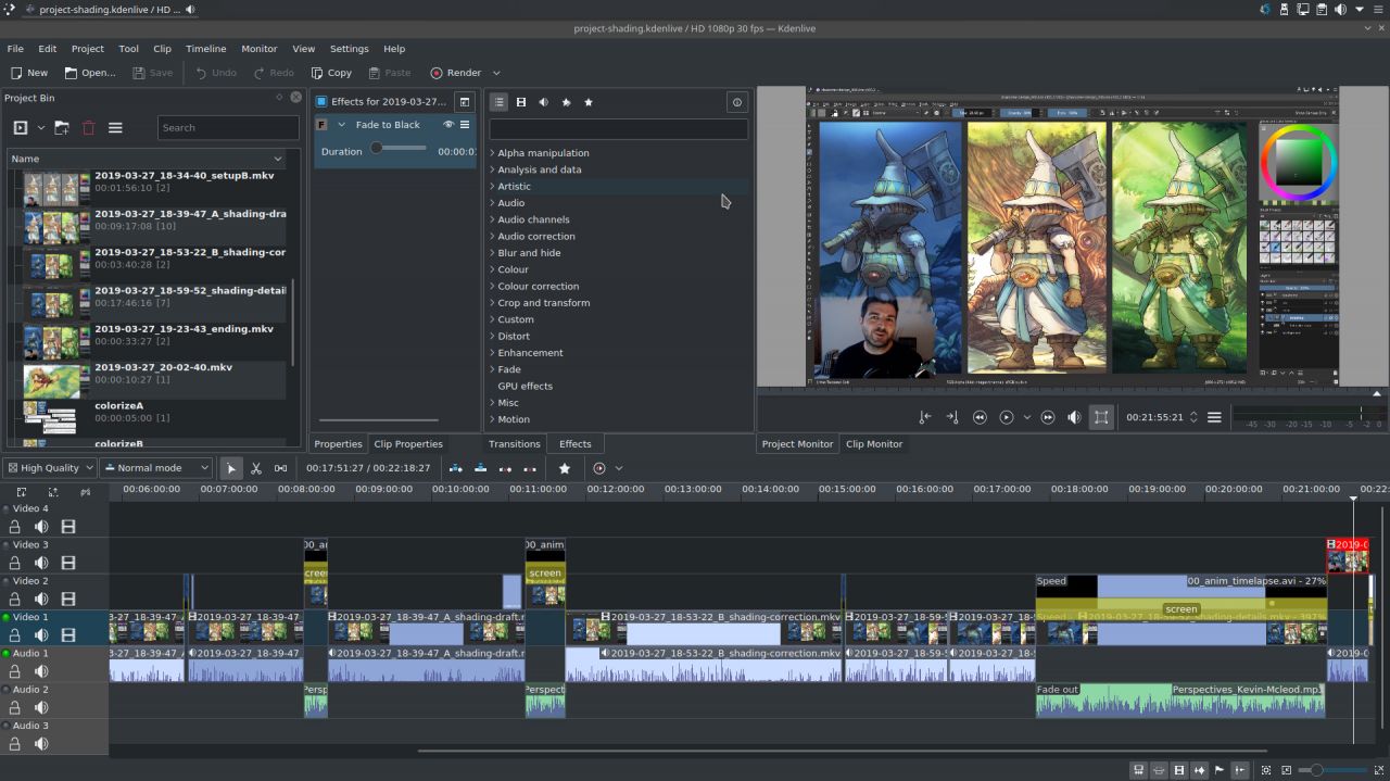
Kdenlive for video-editing my tutorials.

The next step (starting tomorrow) will be to color everything: characters and background and for that I'll use the Colorize Mask and a single shading layer. I explained my method last weeks on two video tutorials I published.

Episode 29 should be ready before the end of April and the process of starting translations before the release will start within the next days and be annunced on the translator mailing-list or on this thread on Framagit. I'll probably publish a third part about coloring after the release.

Mini production report: translation ready

$
0
0
Production secret: I have a coloring assistant.

I prepared this week all the eight pages of future episode 29 with flat colors and I even started to do shading and detailing backgrounds on a couple of pages. I am on schedule for a release of episode 29 somewhere at the end of next week!

Translation ready:
The speechbubbles, texts, onomatopias of episode 29 entered also in 'string freeze' this afternoon (for the French and the English versions). it opens the episode to receive translations before its release. The notes for translators are on this message on Framagit, and if you want to join translation for the first time; you can check how to translate an episode on the documentation.

Episode 29: Destroyer of Worlds

Production report ep29, part 3: coloring and shading

$
0
0
Thank you very much for all the feedback after the release of Pepper&Carrot episode 29 last week. Here is the third and last part of the making-of episode 29. It's a sort of production diary with my notes (it help myself to re-read them years later) and also adressed to the one who want to take the same way than me or for the curious wanting to see how the things are done in backstage. On the previous part 2 of the making of episode 29, I explained my workflow for the line-art but nothing about coloring the episode. So, this third and final part will be about coloring and shading.

Colored thumbnails saves time

I had no idea where to start coloring the episode. What would be the color of the monster? what would be the color of his dimension? So, I opted for painting a quick thumbnails like you can see under and test variations on the first panel. That process is something I usually did when art-directing a game or short movie. I always thought this was unecessary extra-work for coloring a comic. But having this tiny thumbnails really helped later to color very quickly with confidence the final page. I had a art-direction for the color of the full-scene. So this colored thumbnails workflow saved time and provided me a very satisfying experience, I'll repeat doing this for sure on future episodes.


Color research for the other world


Screenshot while applying the color research

Colorize mask: mini palette ref and green screen

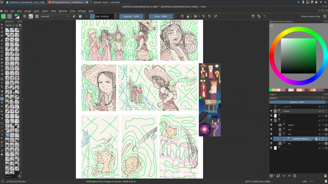
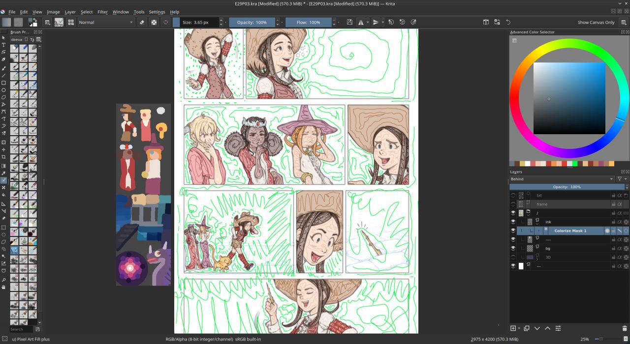
To prepare my pages (flat colors), I used the Colorize Mask feature of Krita (I published a video tutorial last month about it). Everything went fine but after the two first pages; I saw it was necessary to use a system to keep a consistency between the colors of all the characters accross all the pages. So I decided to paint on a tiny PNG a color reference and insert it in all my pages as a Image Reference using the Reference Tool. So I could pick from this tiny picture the color and apply my markers on the picture. It was a bit hard to move the reference palette while being zooming in panel after panel. For sure, it would have been better if the Reference Images could have been 'pinned' at an absolute position on my canvas (a corner). I'll try to report that feature request soon.

For the transparency color, I used a pure RGB green in the same spirit of 'green screen' in video production. It worked as expected and flatting the color took me a couple of days for 8 pages this way.


Colorize mask 'markers'


Colorize mask 'markers'


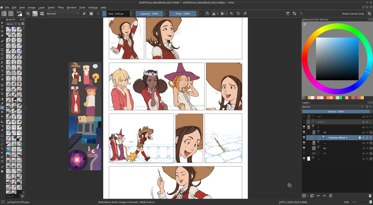
Colorize mask rendered


A better layer stack

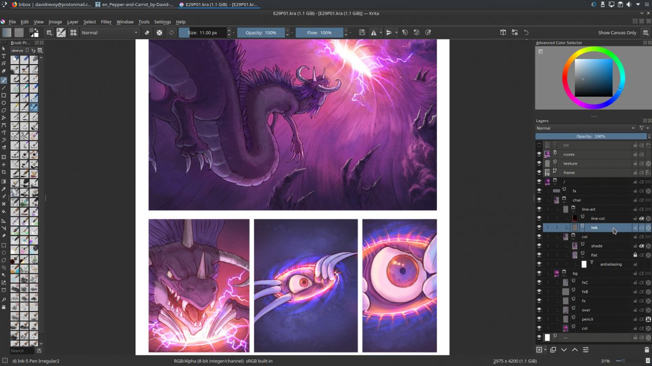
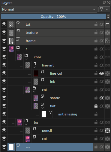
For episode 29, I decided to use a non-destructive workflow and keep a clean layer stack all along the process. So, as I started to get quickly dozens of layers in my way during the process, I had to organize them and give them names easy and quick to type and re-read. I came up with this:


A typical layer stack

The top layers (colored in grey with a right click on them) are the helpers:
  • txt:  A file layer of the inkscape texts, to see the content of speechbubbles
  • texture: one of my subtle texture in SoftLight(SVG) blending mode.
  • frame: a vector layer with white border-less squares to draw my panels layout
Under them, I have the artwork fully grouped under a layer name / (the symbol of the root of the system) and a consistent white background at the bottom named ---. The artworks are split into two subgroups: char (characters) and bg (backgrounds). Character group has a line-art subgroup with in it the ink (inking) and a layer line-col to colorize the inking when necessary. Another subgroup is col (coloring) with the flat island of color dynamically anti-aliased with a filter layer 'Blur' of 1x1px named antialiasing and a shading layer as in my tutorial about shading.

Was it necessary? Yes, the flexibility of this stack once in production was lovely but I admit it was a bit overkill. I probably wanted to test the full non-destructive workflow too much. For future episode I'll probably keep something similar but with less layers. For example, I think I'll keep the backgrounds (bg) flat and not as a group. Also, the colored flat islands for characters doesn't really need a dynamic antialiasing; I thought it would help at replacing a color or selecting an area later; but once the color flatting is done I rarely came back to edit it. So, keeping this as non-destructive was actually more 'in my way' than helping. I could also probably colorize my inking directly (protecting the alpha of a single 'ink' layer on top) without needing a nested (line-art(line-col+ink)) because once the inking was done; I rarely came back also to redraw it... So, all in all I'll keep same structure, naming but I'll also try to simplify it next time quite a lot.

You can download the sources pages (471MB) and spy the structure. This episode is certainly one of my cleanest Pepper&Carrot episode in term of layer stack.

Painting over 3D mockup for backgrounds

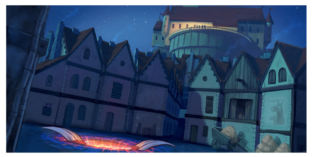
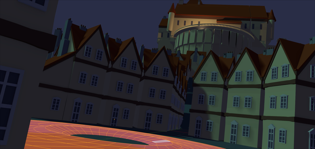
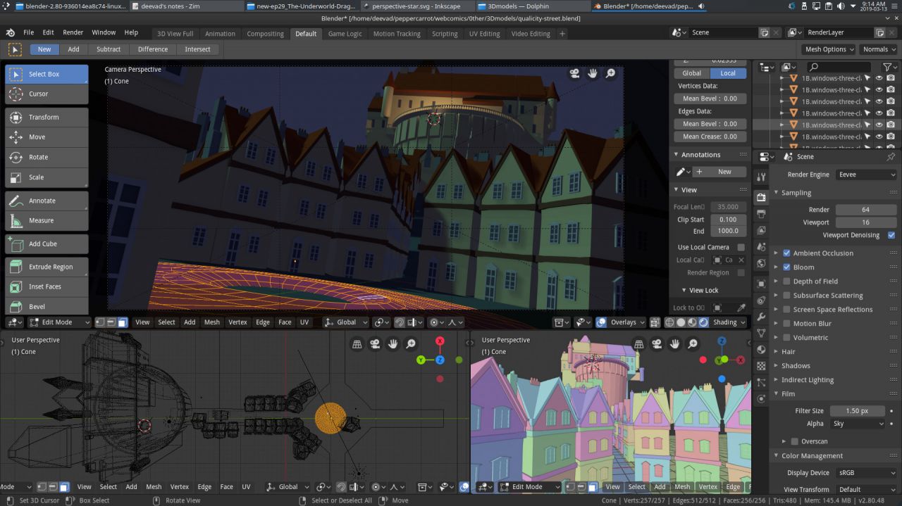
Well, no surprise this part worked perfectly. As you probably know, I'm a specialist of that since decades (I even published a Dvd tutorial about it in 2011, "Blend&Paint" for the Blender Institute) but nowadays with Blender 2.8 and Eevee the work on the 3D part became even quicker and also funnier.

I have to note few things that worked pretty well. For example; rendering the 'world' (sky) with a flat color directly out of Blender was easier to select them later in Krita and split to another layer to paint skies separately. Also, I don't regret to have not textured the 3D buildings, painting the textures of stones and tiles of the roof in Krita is what 'broke' the artificial 3D aspect of the Eevee rendering and made the artwork look a bit more like a painting. I'll keep that for future episodes. It even gives me ideas of more complex and detailed environments.


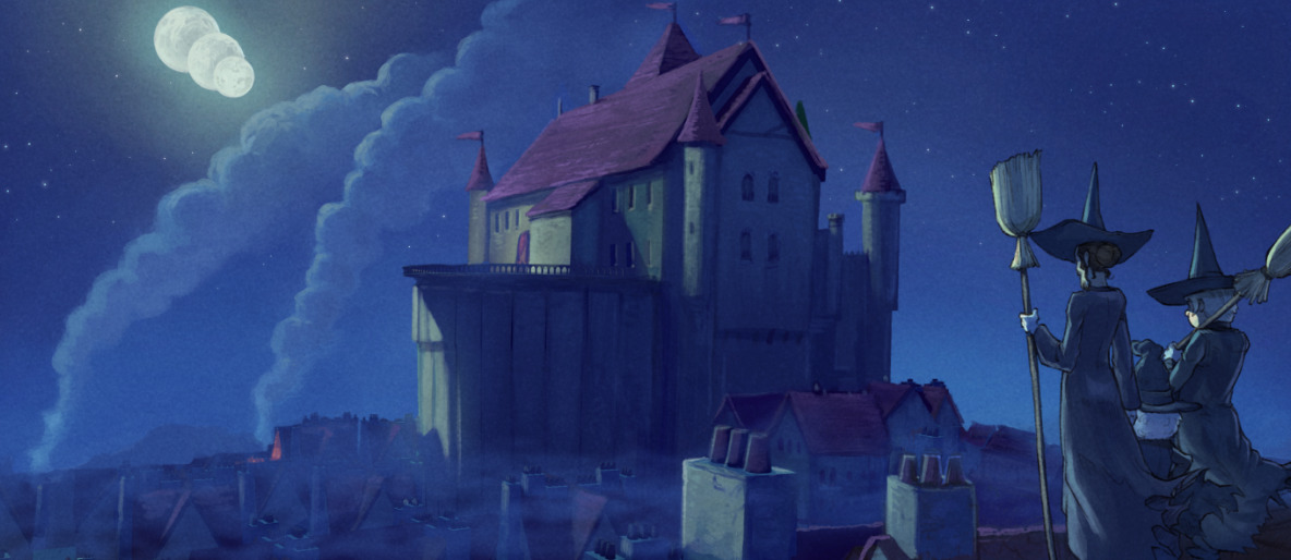
The final panel


The 3D rendered (Blender 3D, Eevee)


Blender 2.8 in action


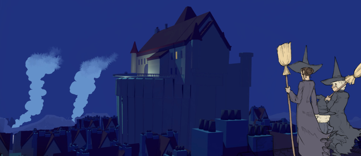
The 3D in background with quick notes (smoke) with the flat non-shaded characters


Same panel with paint-over for the 3D, and shading for characters


2D background painting

I also had many panels with background totally hand-drawn. The good idea I had was to split them directly at the line-art step, while drawing. I drew all of them in blue with a soft edge brush while the character had line-art in black. Then I airbrushed all of them under the line (line recolored into a half transparent brown), and added two more pass: one to block the color under; one to paint over to add hightlight and details. You can also note how it followed the steps for the workflow on the character (line-art, flat color, large shading, detail shading).


Step 1, line-art: backgrounds are penciled separately with blue.


Step 2, airbrush: adding the main color palette and light source.


Step 3, paint-under the line with a large brush.


Step 4, paint-over the lasagna stack of layers for the highlight and details.

Shading

The shading was a hyper-quick step and super flexible. Ideal when approaching the deadline. My hard-light blending mode single shading layer method revealed to be super effective even with the complex light of fireworks, fire, blue moon and pink dimension. I could really color flat my characters with their same base 'albedo' color for the flatting part and really influence later the color with the shading layer, even when changing a dark base color to a bright yellow. This method proofed to be rock-solid and it was easy for me to airbrush the big ideas and art-direction and then do a longer step of cleaning-up and adding edges and other minor sources of lights to detail the characters and their texture even more.


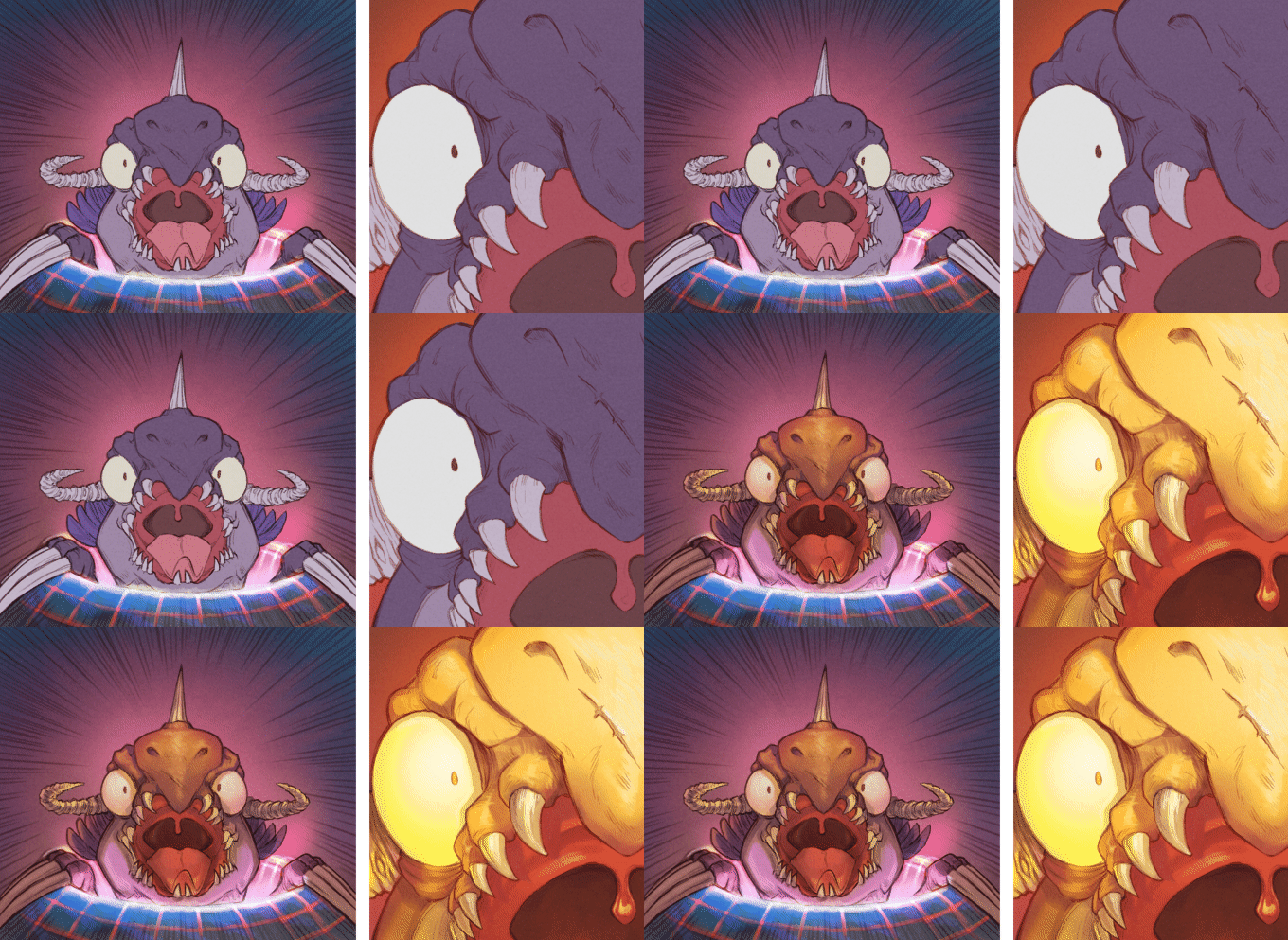
(animation) Shading on/off: extreme light setup.


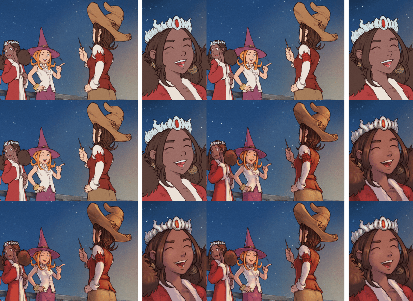
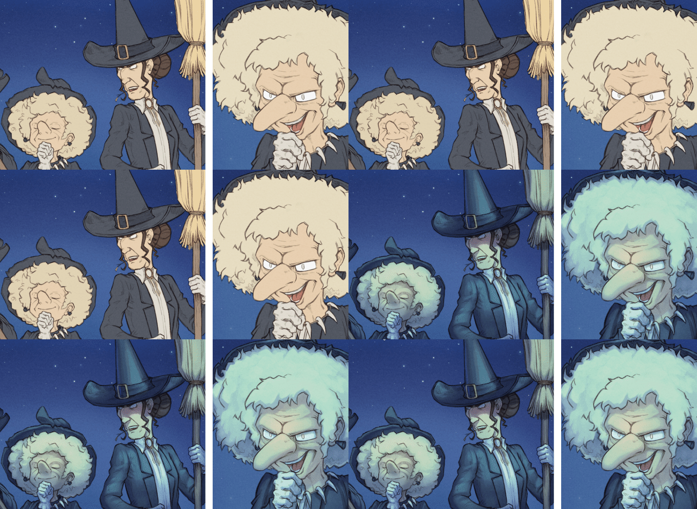
(animation) Shading on/off: consistency on characters during dialogues.


(animation) Shading on/off: consistency on characters during dialogues.

Conclusion

All in all, a lot of research have been done on the way to produce episode 29 but I think all this time was really well invested: it was one of the rare production cycle where I didn't had to skip sleeping during a couple of night before the release to find "the missing 80 hours". The management of my time on the production was constant, linear and predictable. I could say: "by tomorrow I'll finish this pages" and it was done. This linearity really change my way to manage my stress during production. I can't say this is a quick workflow; it is probably not, but the result was up to my expectation and it improved my daily life because I could predict production time and this aspect is golden.

What's next? Optimisation, compression; for episode 30 I'll try to remove what was unecessary while keeping the best part of this workflow. I want: more 'life' in my inking and more painterly background. The result of episode 29 was a bit too industrial for my taste. I feel it's a necessity that creators like me move away as far as possible of all style that can be easily emulated in (a near?) future by computer graphics, deep learning and IA. I'm thinking about 3D and modern anime style. I have feelings that "sketchy and painterly" will be even more precious in the future industry; and even more if they reveal a solid experience of fundamentals underneath: anatomy, proportion, perspective, composition, color, etc... I must follow that intuition and learn to be a little bit less scholar and clean. This will be interesting. ;-)

Thank you for reading! 

Podcast: Digital Strips review of Pepper&Carrot

$
0
0
In the episode 539 of the Podcast "Digital Strips"(the first webcomic podcast!) Pepper&Carrot had a long review (starting at 4:00min to the end at 21min). I loved the review and all the cool feedback. Thank you very much for all the nice words and how you noticed all the little efforts I put into each episodes (the credits, the muted episodes, etc). I spent a very good time listening it!

I also agreed with a critic about the pose of Camomille (the Racoon girl of the Hippiah magic) on the last panel of episode 22. I admit I haven't put a lot of thought in it and the tail and skirt was looking a lot as she was showing her bottom to the audience... Mea Culpa; I think I just wanted to only depict for her a 'Marylin' pose, seducing audience with roses and winds under. I understand the uncomfort and I felt it too when I saw it after listening the show. That's why I decided to commit a fix about it and re-render all languages with the fix (art-pack krita files updated too). It's already all online. This feedback was really useful and you were right: it is totally not in the tone of Pepper&Carrot. I hope the change feels better. Thank you again for the feedback!


Fixing the tail and skirt of Camomille in episode 22

Bird Avatar Generator

$
0
0
Hey, I published a fun Bird Avatar Generator. Enter your name, and get a colorful bird!


I wanted to try to wrap a new theme for my previous Cat Avatar project (2016) in a single day while testing Krita 4.2alpha. A mini challenge to myself done only for the fun and the curiosity to make it work. More infos for license/usage/sources on the footer of the bird avatar generator. Have fun with it!

(Note: thanks to Andreas Gohr's MonsterID code.)


Interview for Touhoppai during Caramanga

$
0
0

The video interview is in French but English subtitles are available in the settings.

Many thanks to the team Touhoppai for this interview conducted on March 9, 2019 during the 4th edition of Caramanga (I went there for a signing session). Super work and subtitles in English and French... wow! 👍


Some of the links mentioned in the video:
Creative Commons: http://creativecommons.org/
Krita: https://krita.org/
Blender Foundation: https://www.blender.org/foundation/
Morevna project: https://morevnaproject.org/
Cosplay pepper&carrot: article587/cosplay-by-maria-and-ekaterina

The Touhoppai team:
Voice: Hana (Daphné Lis) https://www.youtube.com/user/HanaNoMerodii
Editing: zeograd (Olivier Jolly) https://www.youtube.com/user/zeograd
Documentation and transcription: Kagami (Mélanie Fauvergue) https://www.youtube.com/channel/UCrjeyYUvFdm-G-XQdcXduzQ

License:
This video is under CC-BY license, with attribution to David Revoy and Touhoppai as well as the Morevna project and the Blender Foundation in case of reuse of their logo or illustrations.

Production report: New website for Pepper&Carrot

$
0
0
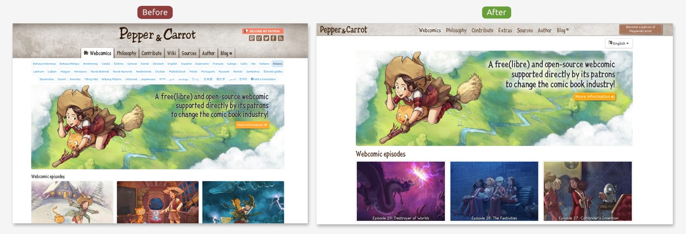
After a big month of hard work, I'm happy to release today the new website for Pepper&Carrot! Here is a list of the fix, improvements, and what's new:

1. More compact and cleaner:

The new website has less buttons on the way and more room for the content. It is now also possible to share the homepage in a target language. Eg: sharing English  https://www.peppercarrot.com/en/ or French: https://www.peppercarrot.com/fr/ .


2. Better language menu

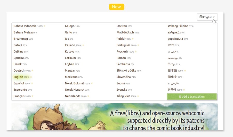
The 47 translations of Pepper&Carrot are now listed under a single button. A percentage indicator will show you how much complete the translation is. If you move the mouse hover a language, a tool tip will show you more data about what is missing. Full translation receives a little yellow star for the quality of the maintainance.


3. I created a new font

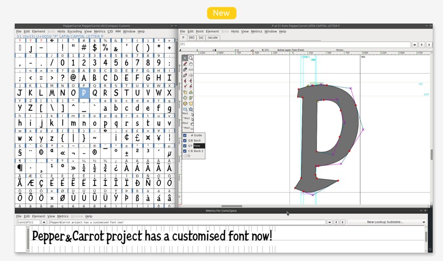
For a better appearance, I decided to use a font hand-drawn like in old books. But none of them were available under Free/Libre license; so I decided to fork my existing "ComicSpice" font with the software FontForge and redesign the letters to give them a "Pepper&Carrot" vibe. The resulting font is named Pepper&Carrot (sources here) and has all latin-extended and vietnamese accents.


4. Disgusted by the flat colored web fashion

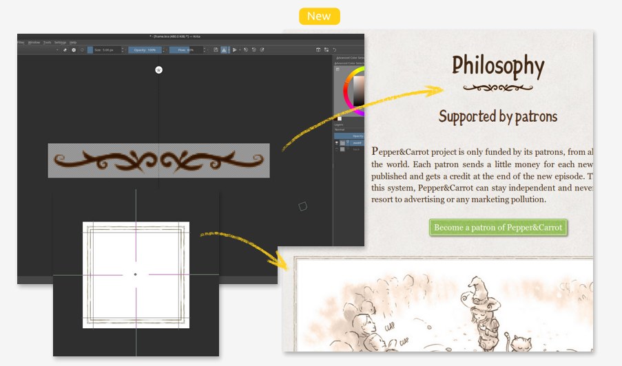
Nowadays, nearly all apps, website, software design comes from the taste of Google, Apple, Twitter, (etc...). I start to dislike this style as much as I dislike the idea that a little group of designer rules the taste of the web. I discovered in CSS3 many tools to add enluminures, non regular borders and frame using bitmap, and paper grain. Doing rich decoration is less easy and takes more time than applying a dull background-color and a border-radius but I think it really improves the experience. Especially in a time where tablets, monitors have a lot of resolution. Krita tools like rulers, symmetry tools, multi-brush, warp-around mode were so precious to design the 'sprite' bitmap I needed. I could this way invent a "modern Grimoire" theming to Pepper&Carrot website.


5. A new theme for the wiki:

The wiki contains a lot of hidden treasures and really worth a read for the pure entertainement. With the new theme it is now a pleasure to read it. Also, all illustrations of the wiki have moved to the source page 'misc' category.


6.  Fully responsive

The redesign of the website was thought for small devices and tablets in mind. It is now easier than ever to read Pepper&Carrot on a pad, a smartphone, a TV, (a toaster?) or on a connected e-reader.


7. New "Extras" menu

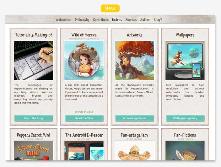
I'm not only publishing webcomics; I'm also publishing a lot of extras and bonuses: wallpapers, tutorials, brushes, artworks with Krita source files... A lot of cool contributions also extend greatly the universe of Pepper&Carrot: Pepper&Carrot Mini, the Wiki, the Fan-Fictions, the Fan-Arts... All of this was really hard to find in the past. Now, it is all linked under a single quick menu.


8. Improved footer of the webcomic episodes:

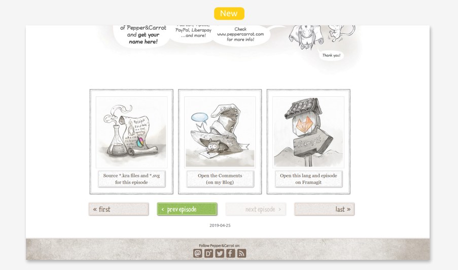
You'll find now a navigation with brighter buttons to quickly read the next episode but also big buttons to access the sources of the episode, comment or directly access to the SVG of the episode on Framagit.


9. New way to contribute: Beta-reading

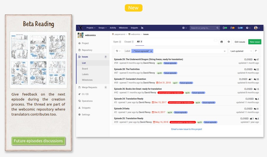
Well, this is not 'so new' because it is something I ran since probably 2 year now but it was only known by the translators and contributors who were familiar with our collaborative Framagit tool. Now it is easier to find in the Contribute menu. You'll need only a Framagit account to interact on this thread as you would do for a forum. (note: nothing started for episode 30 yet, but maybe I'll start a thread in the coming weeks).


10. Easier HD button for Retina and 4K display

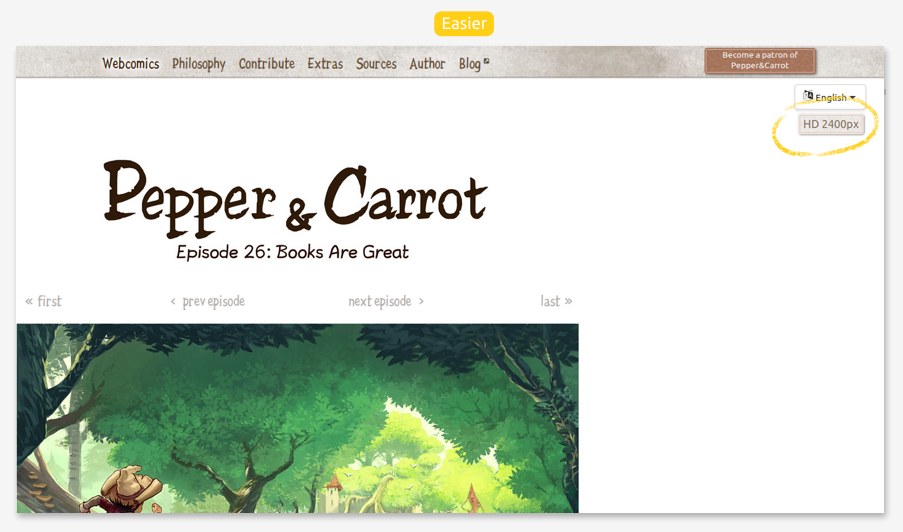
If you have a high definition monitor; you'll probably enjoy reading Pepper&Carrot into a 2400pixels wide resolution! Just click the button and the episodes will switch to hi-resolution. (click again on it to turn it off). As far as I know, Pepper&Carrot is still the only webcomics on the www being high-resolution! On the downside, it will cost you a bit of patience because the page are heavier to load via Internet.


11. Refactored Fan-Fictions, and three novels available to read

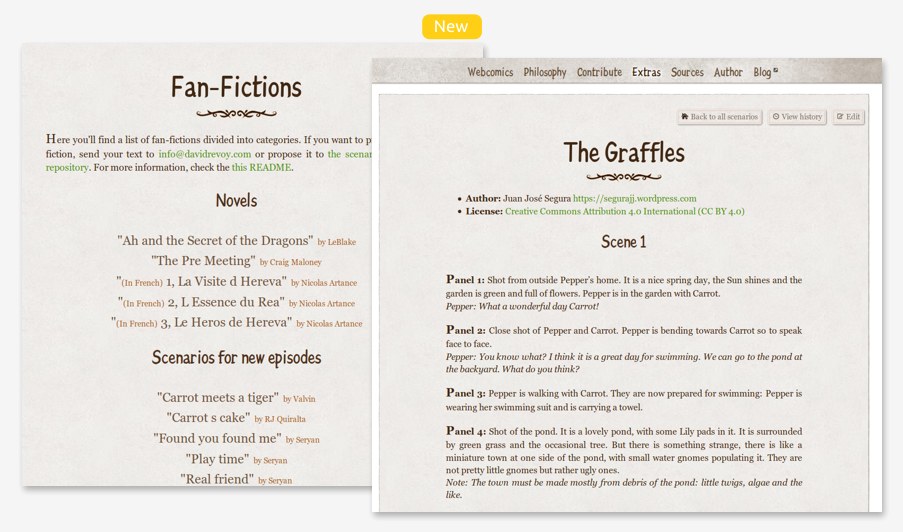
I received many scenarios, fan-fictions and texts (under CC-By license) and I stored them during my journey on a git repository... but I never had really the time to link them to the website. Now all fan-fictions are hosted, themed, and ready to read but also ready to receive corrections. You can also propose new fan-fictions. And big bonus for the French readers; the three novels wrote by Nicolas Artances about Pepper's adventure in Hereva are now available and it is a read I recommend if you like the universe and the humor of Pepper&Carrot.


12. Under the hood

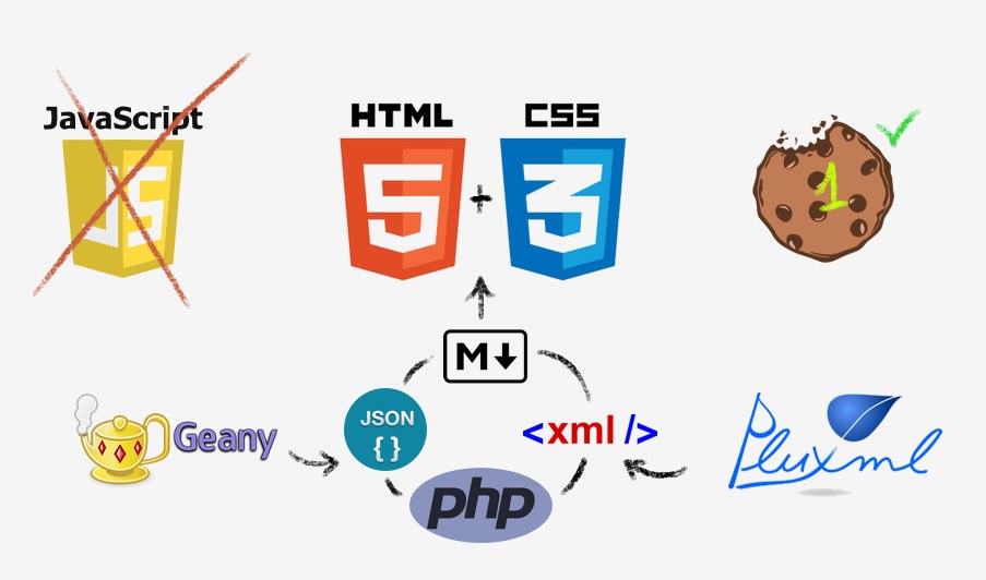
For this redesign; I only did incremental changes (all visible on Framagit) over the old base and I still use the lightweight CMS PluXML, PluCSS and the multilingue plugin. I still write only Php, Html and Css using my favorite editor on GNU/Linux Geany. I also use Markdown, Json and Xml for data. I use only a single cookie to store the favorite lang for a couple of week (so I don't need to tell with a toolbar 'do you accept cookie' because this usage is ok) and I don't use Javascript because I don't like writing it and I'm really "old school" for my websites. You'll find no Google analytic, no bad tracking social-media buttons, and no adv. Your privacy and security is safe while browsing Pepper&Carrot.


Conclusion:

I'm really happy this is done now. It also prepares the place for a future big news. Unfortunately, I choosed on Pepper&Carrot to receive support only when I release a new episode; so I funded the time of this refactoring only with Freelance work. I guess that's the price of independance...

That's why I sincerly hope you'll like all the effort I put into this new website ;-)
https://www.peppercarrot.com/

It's boiling hot... blllblllblllblllblllblll...

$
0
0
Hey patrons and readers! The weather temperature has been over 30°C since a big week here and it's boiling hot! This artwork comes from a series of sketches I have done in June. It was challenging to paint it today with the water transparency and the mix of solid and organic shapes but I'm happy with the result. I put the HD here (if you click on it) and I release this picture under the Creative Commons Attribution license. I painted it on Krita 4.2.2 + Cintiq 13HD on Kubuntu 18.04. Krita 4.2 generation is running very well here, 4.2.2 is very stable, smooth and I really enjoy using it. I probably not entered a new bug report since two or three weeks. That should help me for producing future episode 30.

On other news, I start to see the completion of the various freelance comissions I accepted in May/June and I enjoyed this break in-between my usual rythm of episodes and tutorials. I still have work to do to complete two bigger pack in my comissions but I'll handle the remaining part in parralal of a new Pepper&Carrot episode production.

Production report, ep30: Storyboard

$
0
0
I'm writing this blog post to inform you that the future episode 30 storyboard is now available for "beta-reading". It's a story I wrote without speechbubbles about Carrot. The artworks are still very rough and you'll find on this storyboard only bright-grey digital pencil sketches with perspective and anatomy "eyeballed". While drawing this pass, I was mainly focused into the story and the composition of the panels.

You'll find a link to read the full pages

As you might already know, I open the full process of my episodes since a long time. I open it without requiring you to be my patron or locking this process behind a paywall (as most of other artists does nowaday...). All my videos, sources files, wallpapers, making-of, tutorials and brushes are free/libre and online. So, if you like the content I'm producing and the way I'm doing it, consider to hit that red button on the top-right of my website and support my work. I guarantee you'll make an happy artist. ;-) (PS: And by the way, I'm sending here a big big thanks to my patrons!)

Starry night

$
0
0
(a preview of the first panel from future episode 30, work in progress)

Sketchbook during Krita Sprint 2019

$
0
0
Hey! I'm back after a small week at the Krita Sprint 2019 (Deventer, Netherlands). You probably saw already photos about our large group this year (eg. Mastodon link here) and I guess you'll probably read in the coming days a detailed reports about the Sprint on the blog of krita.org itself. So! I'll skip writing a detail report about our discussions and I'll focus my blog post around my sketchbook and more precisely about the sketches done since I started to travel on Tuesday.

I drew various random ideas, various tests and various quality; some were done during meetings, some other on the side of my plate at restaurants, some other in plane, train or even while walking into a guided tour of a museum. You can click any picture to get a better resolution. Again a big thanks to all participants I met on the Krita sprint of this year, I had a very good time.


top: Pepper finding a 'prince frog' and Cumin affraid about it.
bottom: ideas of fantasy animals.
(from imagination)


Top: another fantasy animal, a Saffran,
Middle: a sleeping female fox,
Bottom: Pepper fighting a Jelly-Monster.

(from imagination)


observations at the the Netherlands Open Air Museum,
during the guided tour (real life ref)


more notes during guided tour (real life ref)


Animals during guided tour (real life ref, observation)


On the afternoon, a watercolor of a windmill on blue paper with white gouache


Another view of previous painting


An attempt at a shaded scene (from imagination) including a Pepper
with another haircut, a school uniform and her bag.


A study of pose from imagination, constrain of force and acting,
plus few notes on a discussion about Krita.


A collections of four random portraits to get
"outside of comfort zone"; changing proportion, style.
(from imagination)


Young boy with pig; unfinished
(from imagination)

Derivation: Witchcraft RPG supplement on Kickstarter by Xacur

$
0
0
Illustration: Example of double page of the book (in development, not final) by Xacur. I downloaded it from the Kickstarter campaign and pasted on top the mockup of the PDF cover and a Kickstarter logo. All of that to get a quick "single-picture-presentation" of the project.
(CC-By Xacur, with illustration of D.Revoy; note: logo of Kickstarter is certainly 'all right protected...')

While I was in holidays, I received notifications about a new Kickstarter project using the open illustrations and sources material of my webcomic Pepper&Carrot in a campaign named:  Witchcraft: Magic of Hereva, a 5e Supplement. Usual disclaimer: I'm not involved into this Kickstarter (only the illustration and world of my webcomic are reused as open material) and I'm not earning any cents about it.

The author of the Kickstarter and recipient of the benefits, Xacur, is not (as far as I know) someone known among the 50 ocasonial contributors of Pepper&Carrot. The project poped a bit out of the blue suddently this summer. Anyway, I did a review of the page this morning and it is a nice one and has at a first glance the appearance of a work of passion, with a lot of care about the licenses and a respect for the source material of the world of Pepper&Carrot. I can really feel the dedication of Xacur to make a good result for this PDF supplement for the 5th Edition of the most popular Role Playing Game in the world. So, if you want to play a witch in Hereva on a RPG, supporting the author and get the PDF of this project sounds like the best option right now. Also, I'm really happy to read this: "New art and new rules created for this supplement will be released under CC by 4.0 and Open-Gaming License respectively". Something that could probably make this work something I could backport to the official Wiki of Pepper&Carrot? I don't know yet, I have to study that but it sounds like it could be possible and if it is that could be something good for the tiny ecosystem of Pepper&Carrot. (If you know more about it, please let me know in the comments).

All in all, I wish good luck to Xacur into this project and I send them here an invitation to not hesitate to enter into contact with the Pepper&Carrot community. I'm really interested to know if this future work crowdfunded can be backported into the official project (and I'm sure audience of the webcomic too). If any help is needed to get more details about the universe, the timeline, the background of characters: Cmaloney (maintainer of the Wiki), Nartance (Writer of many detailed texts on the world of Hereva) or me are often around our bridged discussions channels (URLs of this channels on top here) and we can help to brainstorm ideas around the universe. Waiting for that, I'll follow this derivation for sure.


Pepper&Carrot derivation: a third book printed by Glénat

$
0
0
me while unboxing my "sample for author"

I received this morning the third French Pepper&Carrot book printed by the publisher Glénat Editions (one of the largest comic book publisher in France). I'm so happy to have it in my hands after all this time! "The butterfly effect" ("L'effet papillon") is the title of this book that bundle episode 22 to 29 and more than 60 pages of my webcomic Pepper&Carrot. It will be released in France somewhere around next week on 28 August. It took me a lot of time to draw all this pages to feed this book with the help of Krita and Inkscape on my GNU/Linux Kubuntu operating system. Sorry again for the big wait and thank you for your patience. The derivation of Glénat Editions started in 2016 for the book one and the first two books were a success thanks to the audience. I've heard the book were reprinted many times. The series received even a collector bundle with book 1 and 2 for Christmas 2018 (photo under). Even nowadays, I keep seeing the books in the shelves of supermarkets, bookstores, schools and libraries. That's a really cool partnership built with Glénat around the Creative Commons Attribution 4.0 license and a beautiful story.

Well, that was not always the case, especially at the public release of the book one in 2016: my new paradigm for comic wasn't received positively at all by the comic industry (Ref: "L'affaire Pepper&Carrot" -blog post in French- by Phylacterium blog). It was a big fuzz in the specialized press and medias about comics. Nowadays, things seems to have gone back under the radar with time; the second book made no issue at release and I hope this third new book will follow the same path and not get issue with the syndicate of French comic authors. If the syndicate of French comic authors wants to fight something, I invite them to go to read the conditions and terms of use of the big comic platform like Webtoons or Tapas and digg a bit about their consequences on the industry. I would prefer them to spend energy on copyright and license issue instead of shooting small independent webcomic author as me who tries new project made of patronage, ethic and the creation of a common... But I understand it is easier to show dominance over a single artist than in front of giants of the industry?

On my side, I'm still on my way to propose my alternative model and oppose to the usual industry buisness model based on copyright, proprietary fictional universes, teasing & paywall market... But my quest takes more time than I thought, Pepper&Carrot is already five years old! I certainly came with this proposal and ideas too early and the crowds were not ready and not enought concerned deeply by investing efforts into common resources, independent systems, small collaborative structures, trust and license freedom. But I'm confident, alternatives needs to exists and Pepper&Carrot exists thanks to the support of the audience! I'll continue this quest and produce more episodes and fill a book four, five or more as long as I can.


The three books and the bundle on left

As a usual, I'm writing a disclaimer here about any Pepper&Carrot external commercial derivations: I remind you I'm not earning any percentage of the sales of this book. I'm earning my money only via the patronage of Pepper&Carrot new episodes and Glénat is still the number one patron of the project since 2016. They also commission me extra illustrations as the one for the cover (illustrations released under CC-By license). So Glénat is weighting big in the ecosystem of Pepper&Carrot (they help this way at founding 1/4 of the budget of each episodes). That's why I have no issue promoting them as partner and encouraging audience to buy this derivation: I'm transparent about it.


The yellow of this scene renders really well printed.

Also, a big thank you to all contributors and proofreader who helped at improving this collections of episodes. The license attribution is respected into the details and can be found on the first pages of this printed version. A special thanks to the French translators: Nicolas Artance, Calimeroteknik, Midgard, Valvin who helped me to translate the episode from English to French (because I wrote many of this episodes directly in English to ease the collaborative storyboard beta reading system process). Also, the full list of credits and patrons of Pepper&Carrot is printed at the end of the book.

All in all, I'm really happy about this third book. I saw the price was a tiny bit more than 10€. If you want to purchase the third book, please consider buying it in your local bookstore that can be still better than in a big online market place. I recommend A Livr'Ouvert on Paris, Les petits Ruisseaux on Toulouse.

Have a good read (or re-read) if you buy it next week ! ;-)


close-up: print quality is good, even on dark panels

Viewing all 526 articles
Browse latest View live