Intro
Last year Purism contacted me after they read on the Pepper&Carrot blog that my laptop has been stolen in the burglary of my house. At that time, they proposed me to contribute to my Pepper&Carrot project by sending me a shiny new Librem13 laptop. So, since October 2017 I have this laptop with me and because I saw a lot of curious on social network, I thought it was good time to make a review. In the last 7 month, I accumulated experience with this hardware (I took it for my course in Paris, conference in India, in Switzerland and recently in Poland...). I also could test three GNU/Linux distribution: PureOS, Fedora GNOME and Ubuntu 17.10. The question now: is this laptop a good one for digital painting on GNU/Linux ?
Unboxing:
In the past year with my previous laptops, I was used to "no-name" unboxing experience: cardboard colored style from e-shop who were just rebranding quickly and with minimum of effort cheap Clevo; so it's a good surprise for me to see the Librem13 was packaged with care and with elegant branded black and white box and a dedicated Quick Start Guide. It feels polished. The power charger is standard size as what we could see on the market since the last 15 years; still too big for a modern slim PC laptop, in my opinion. The PC boot at first with dialogs to configure a preinstalled PureOS (Purism in-house GNU/Linux distro; very similar to Debian-testing with GNOME desktop).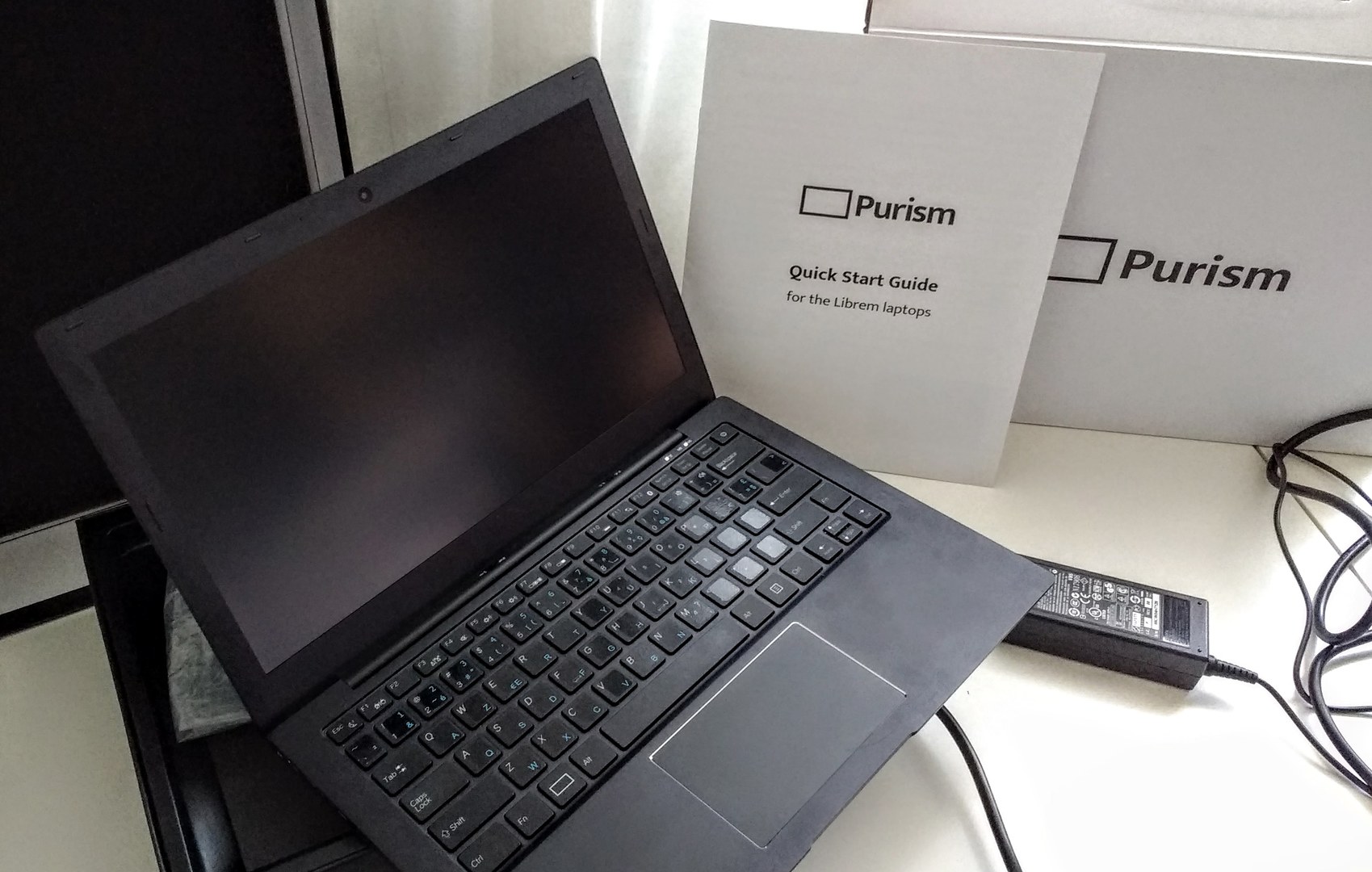
General
Here is the spec of my Librem13:
CPU: Intel Processor, Two Cores, Four Threads, 3.10GHz i7-6500U.
GPU: Sixth Generation Intel HD Graphics 520.
RAM: Fast Memory Galore, 16GB, DDR4.
Storage: 250GB M.2 SSD.
Monitor: 13.3″ Matte IPS Display.
Case: Anodized Aluminium Chassis.
Video output: HDMI output.
Bios: SeaBIOS
O.S. for the test: Ubuntu GNOME 17.10
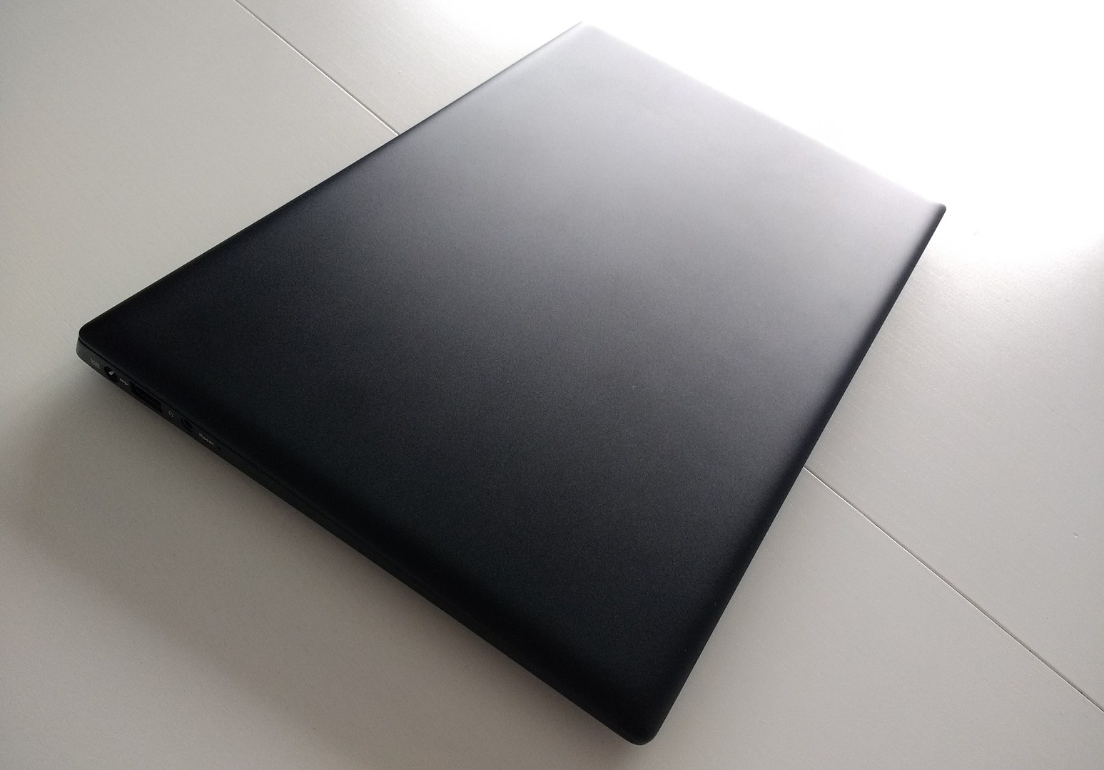
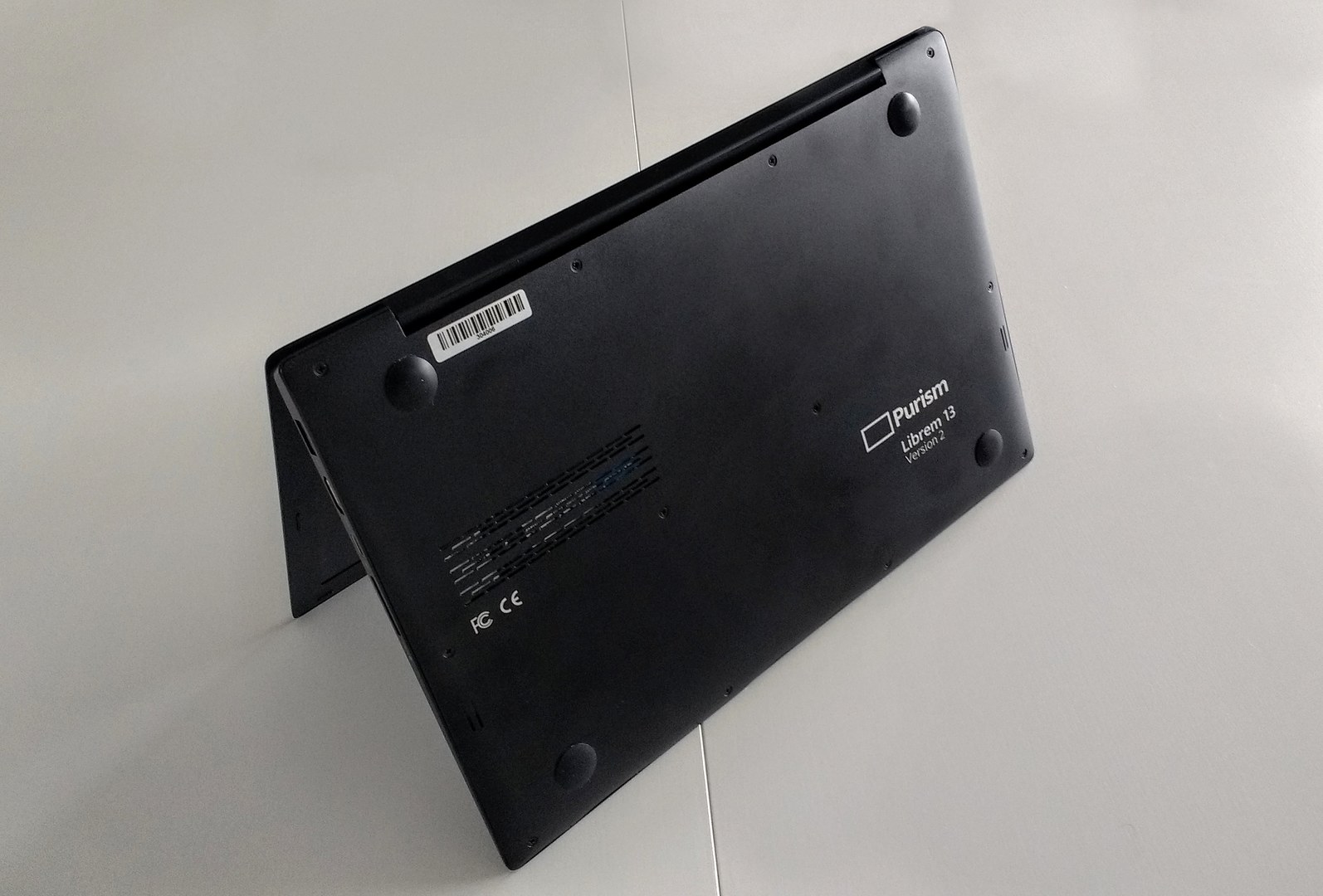
External case: It's a slim, minimalistic and beautiful object. The anodized aluminum case feels really high quality. I really like how the case is not branded with obtrusive logos or texts. It is just written on the bottom of the laptop.
Usability
The laptop is simple to use, there is no surprise from the hardware to software. Installing a new GNU/Linux distro on it is a breeze: everything just work and the SeaBios makes everything so simple (far, far away all the horrors of the modern UEFI!). I had no problem with Ubuntu or Fedora on it; it's clearly the type of hardware that has this potential of not being affected by many bugs related to hardware support. That's probably because Purism have all their in-house dev porting directly fix into Debian testing. I also like the fact it has almost the same size than my tablet Wacom Intuos4 Medium (see photo under) ; it's a good pair of hardware when I'm traveling. The laptop doesn't suffer particularly of being very hot and keep relatively silent all the time (I tested in the hot days in India). The sound of the fan is even not really loud while using all the power of the CPUs (eg. when compiling Krita or rendering scene with Blender).I also experienced opening the case to add or remove a SSD, something possible to do in 5 min without damaging the unit and with a simple small screw driver.
Performances
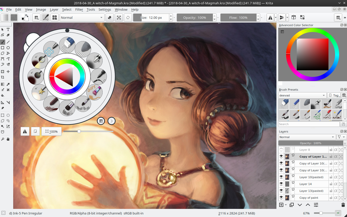
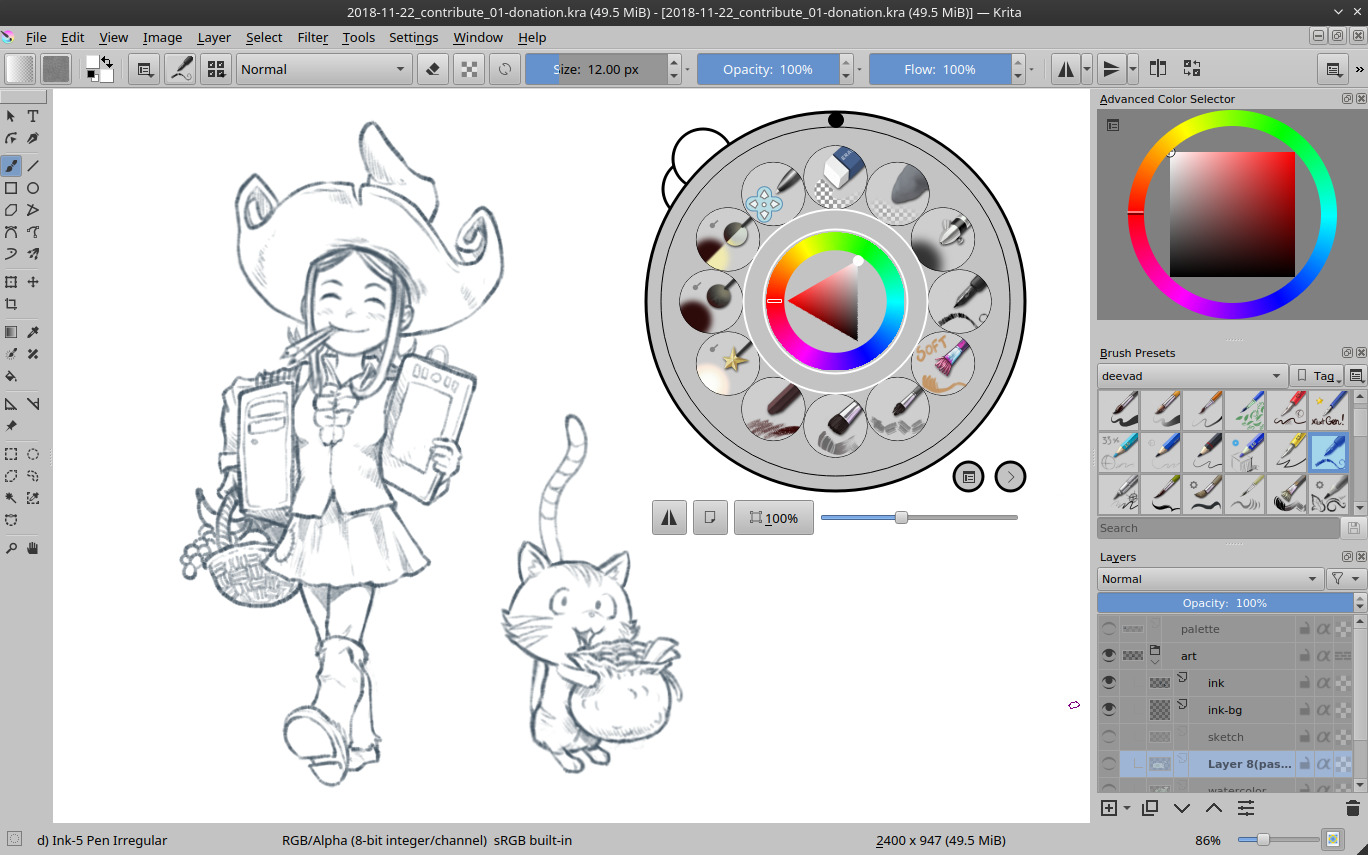
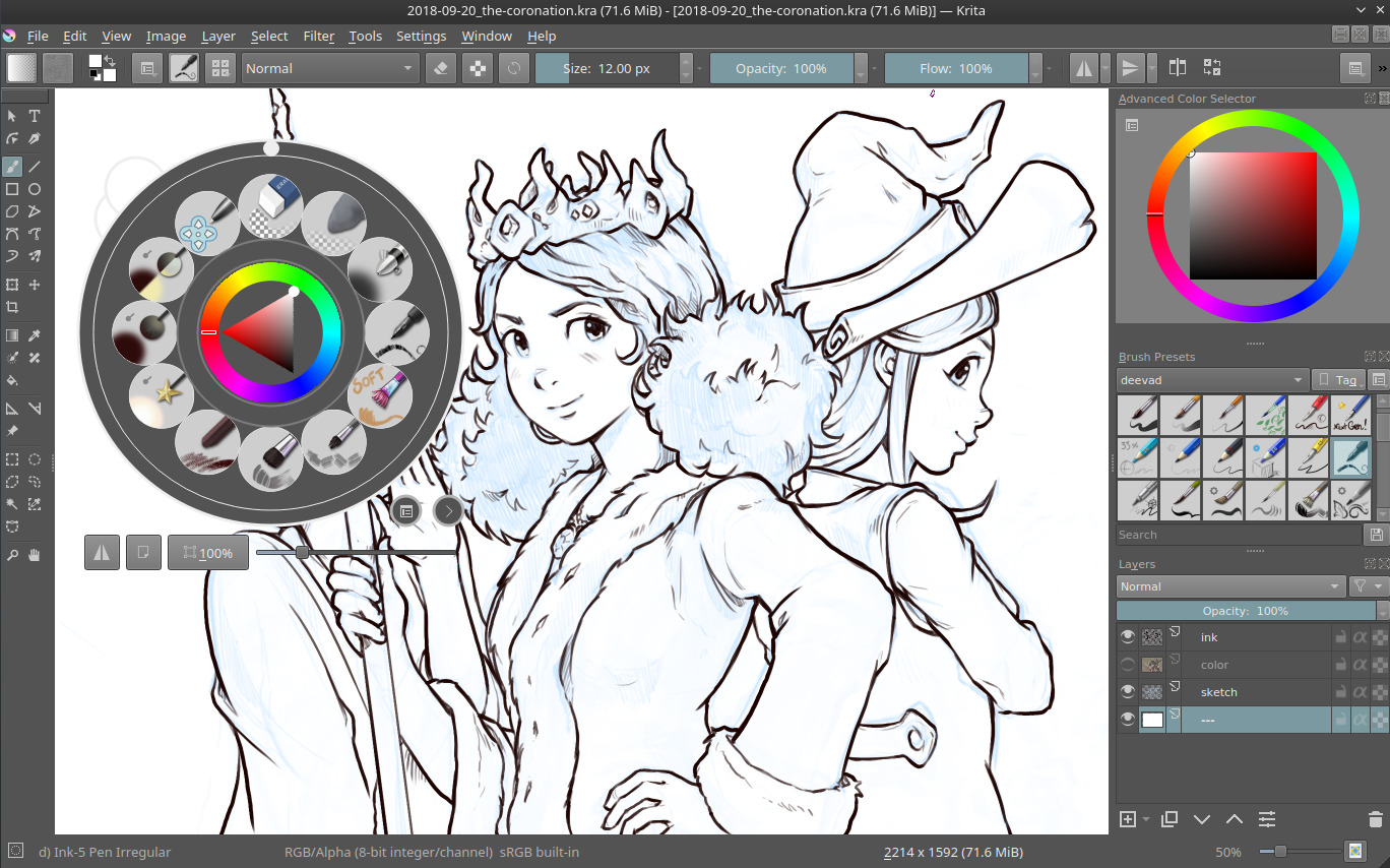
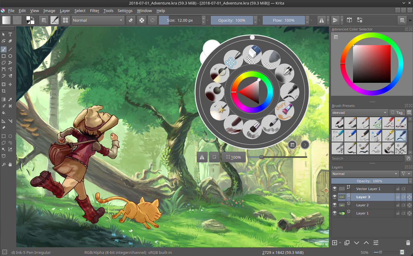
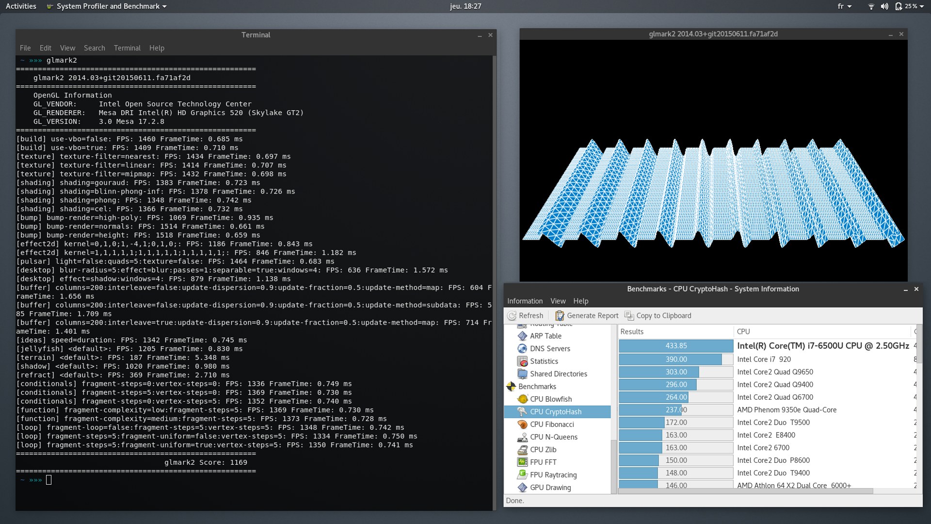
Digital painting:Krita 4.0.x doesn't really suffer while painting on a A4@300dpi. It's the file format and resolution I use for the page of my webcomic Pepper&Carrot. Even when using large preset and the smudge brush engine it's still possible to paint. "Instant Preview" works also pretty well with the Intel HD Graphics 520; it has even less glitch than the more powerful Nvidia card on my workstation with Nvidia proprietary driver. The performance are correct but I wouldn't probably cross the 4K or 6K resolution with this laptop. Expect little slow down here and there on complex work but that something totally acceptable for an ultraslim laptop.


Keyboard
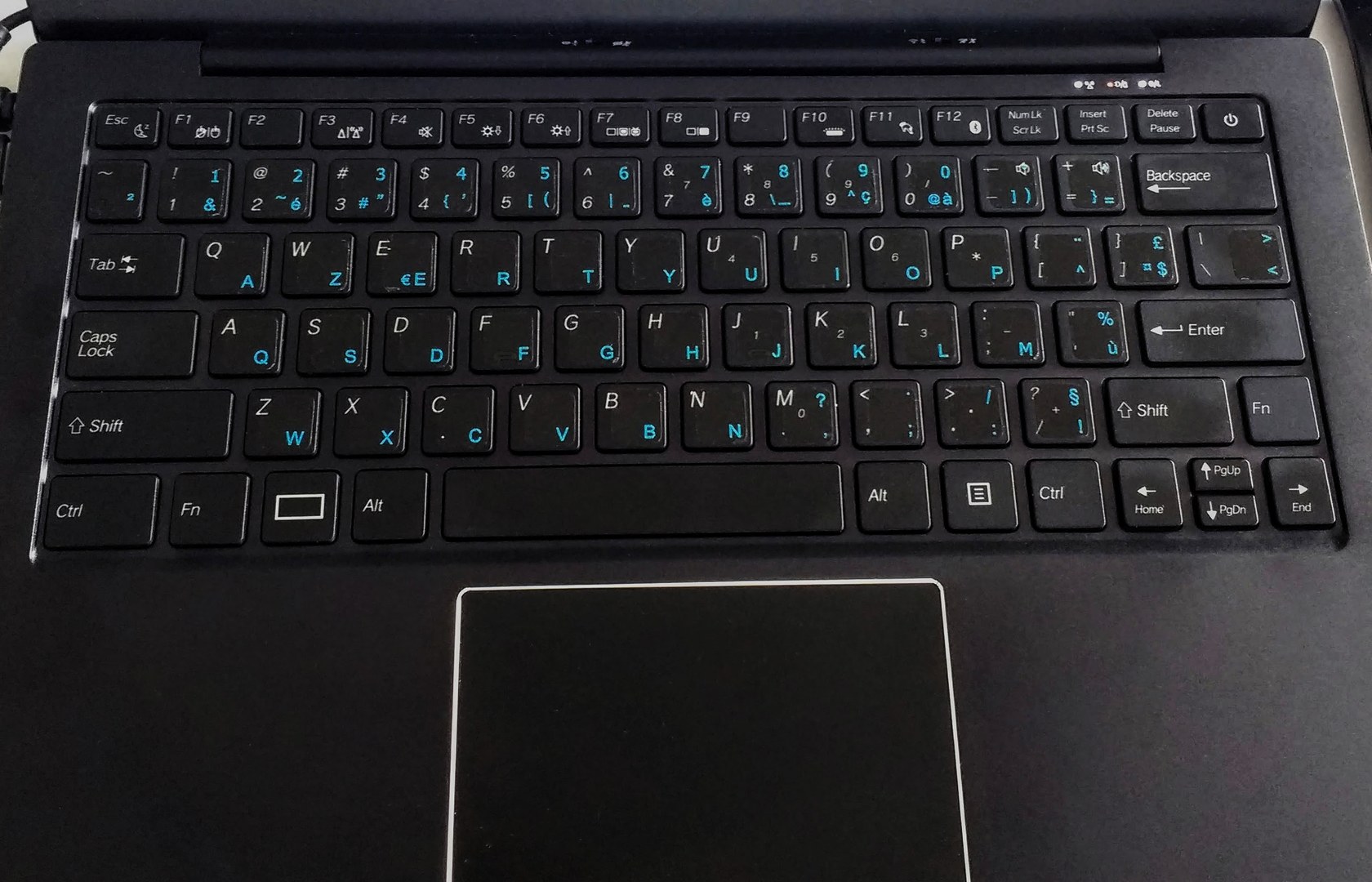
At the time I received it, the Librem13 was available only with a QWERTY U.S. keyboard layout (recently, Purism added the German and Qwerty U.K layouts ). I type things since I'm a kid on French AZERTY keyboards. It's too hard to remove a so deep habit; so I opted for a little customization of the U.S. layout and I added Azerty stickers. The stickers are extra thin and I don't feel them under the fingers when I type, they just are glossier than the original plastic. After the transformation, it took me only two or three hour to type as fast as on my favorite keyboard and I really like the quality of it. Also, I like the Purism logo by default on the "super" key.
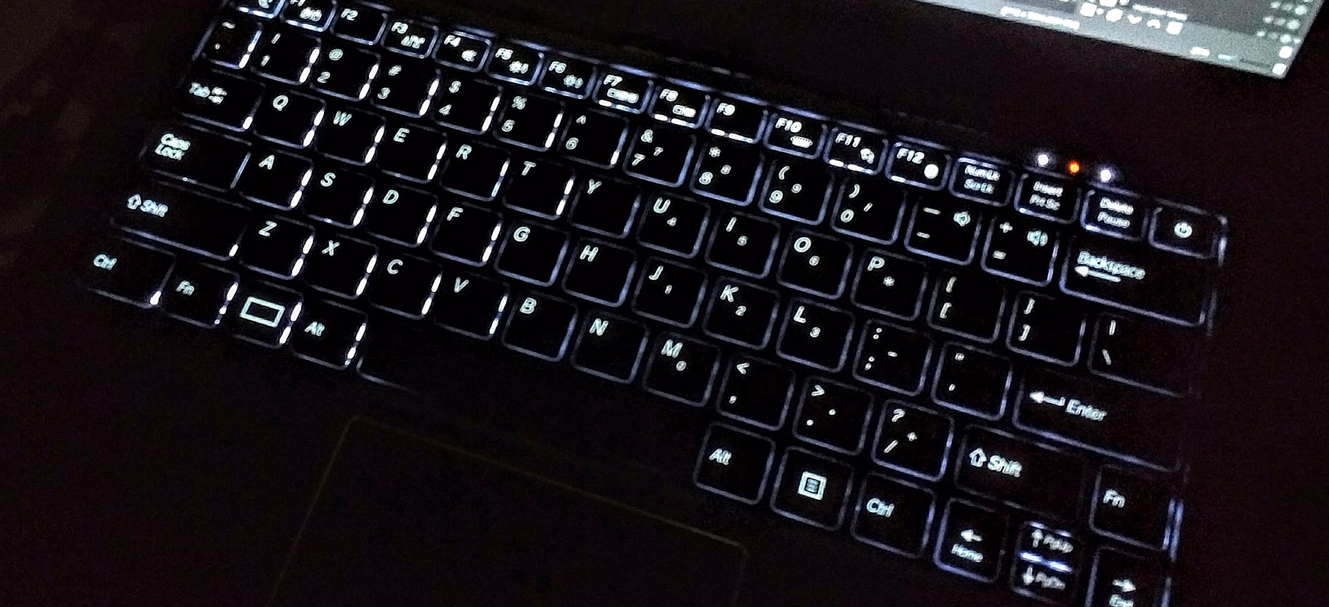
click to enlarge
The retro light in action.
Monitor
The 13'' ISP 1920x1080pixels monitor is not glossy and the anti-reflect coating on it is smooth and not grainy. So, all the artworks and graphics looks always sharp (and side note: it's easy to stick my Pantone Huey Pro calibrator on it).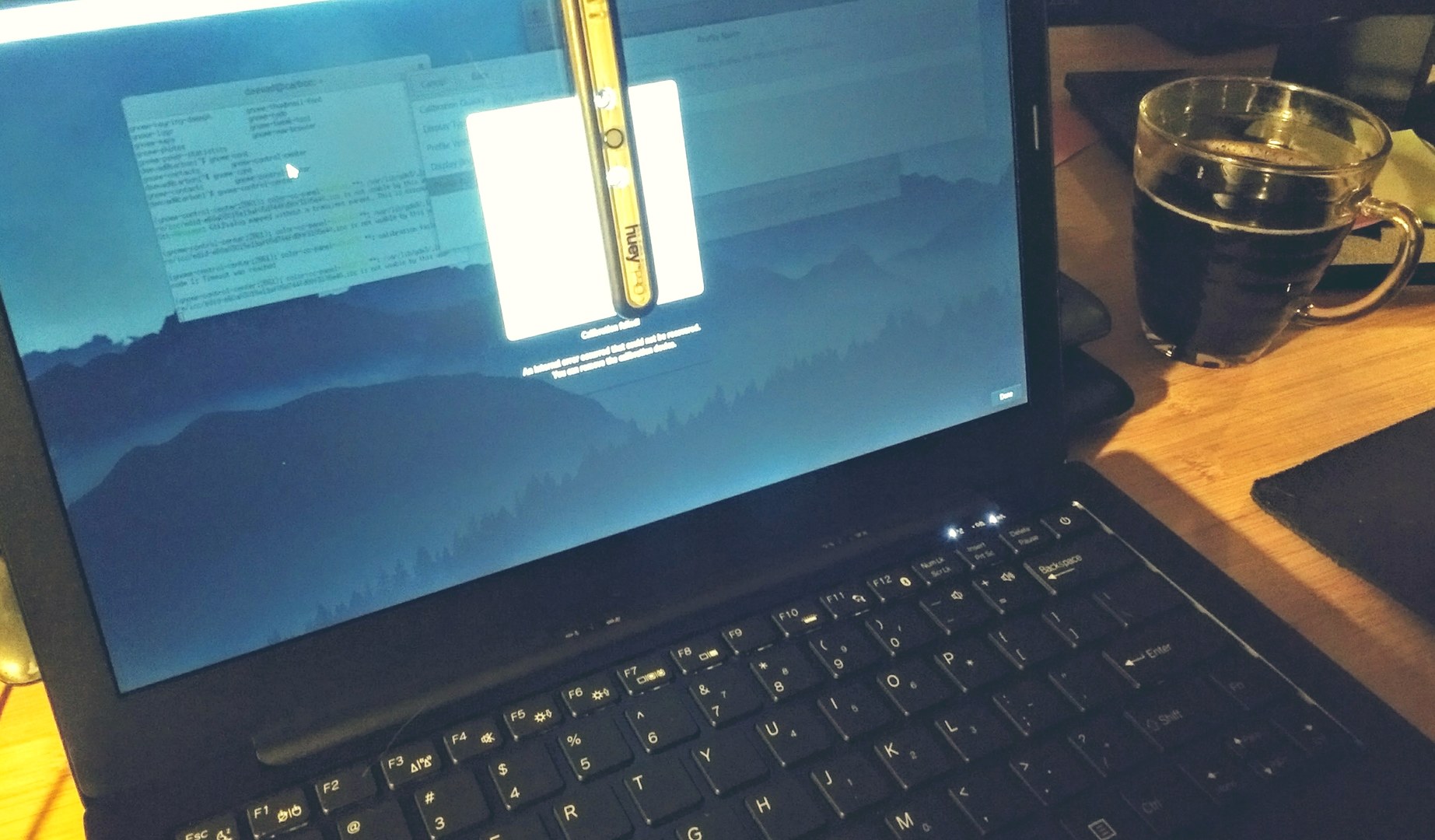
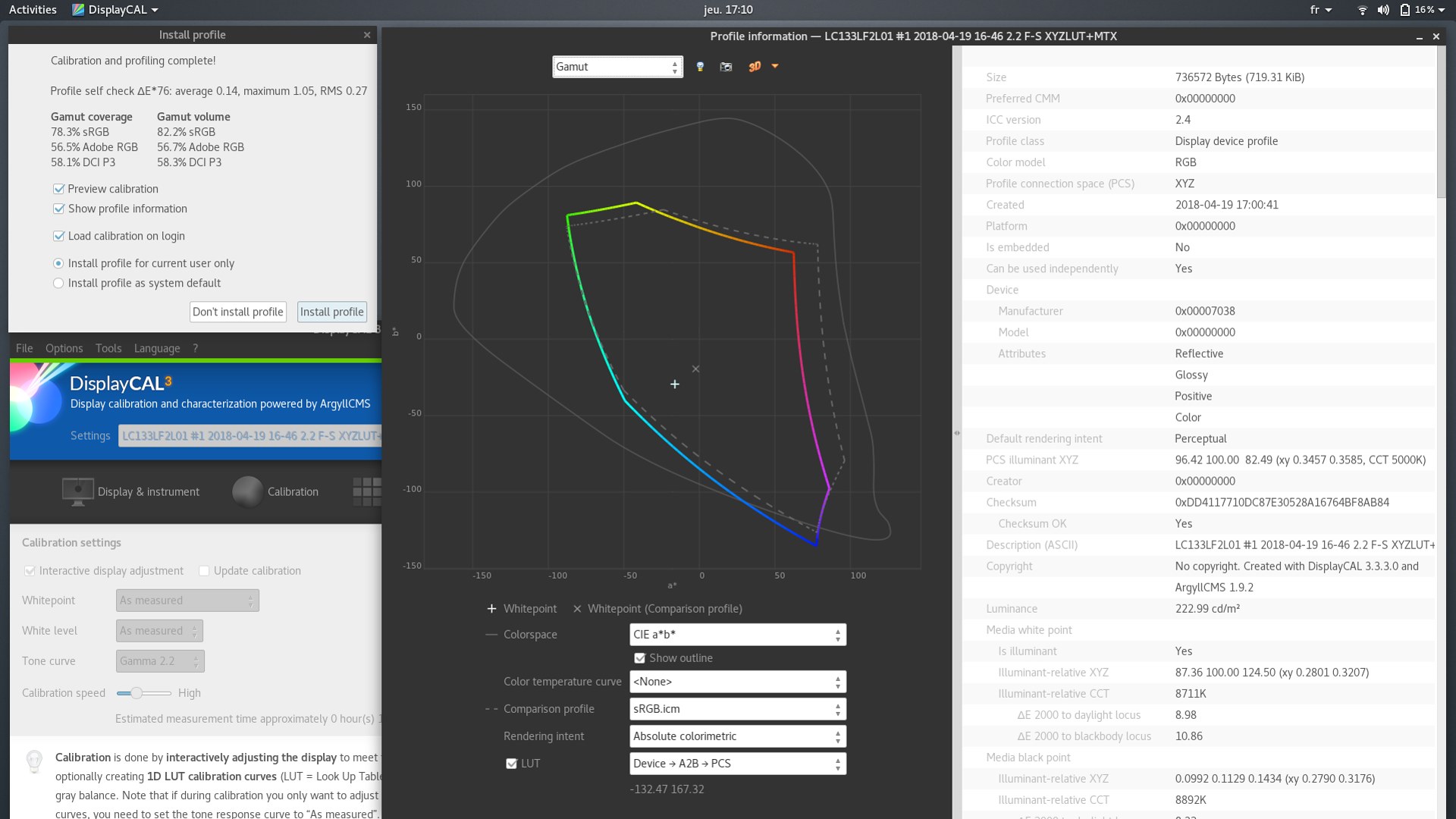
The maximum light measured is around 220 cd/m² , very good for a laptop but the default colors are way too greenish out-of-the-box. It's possible to calibrate it to get something healthier and better color, because with default like that you can't paint any good colored artworks. This monitor definitely needs profiling.
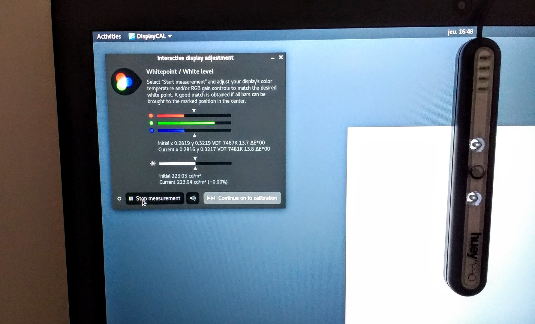
Color space: a quick profiling ( software: Displaycal ) with simple settings reveals slightly truncated oranges and reds in comparison with sRGB ( normal if the monitor tends to be super green ). Another surprise: this monitor is able to display certain type of deep blue outside the human perception of colors. So, the ultra-orange color branding palette of Ubuntu doesn't look so fruity on this laptop while Fedora wallpapers will look really deep. But it's possible to create a profile to correct it. Especially if you worry about the effect of the blue light on the health of eyes.
Misc
Battery:The battery is really good for a GNU/Linux laptop. I was used to laptops with two hours maximum while typing and 30min while painting. This one can go almost to four hours while typing and 1h30 while painting. Sometime even more, it depends the backlight settings and your activity with it.
Video output:
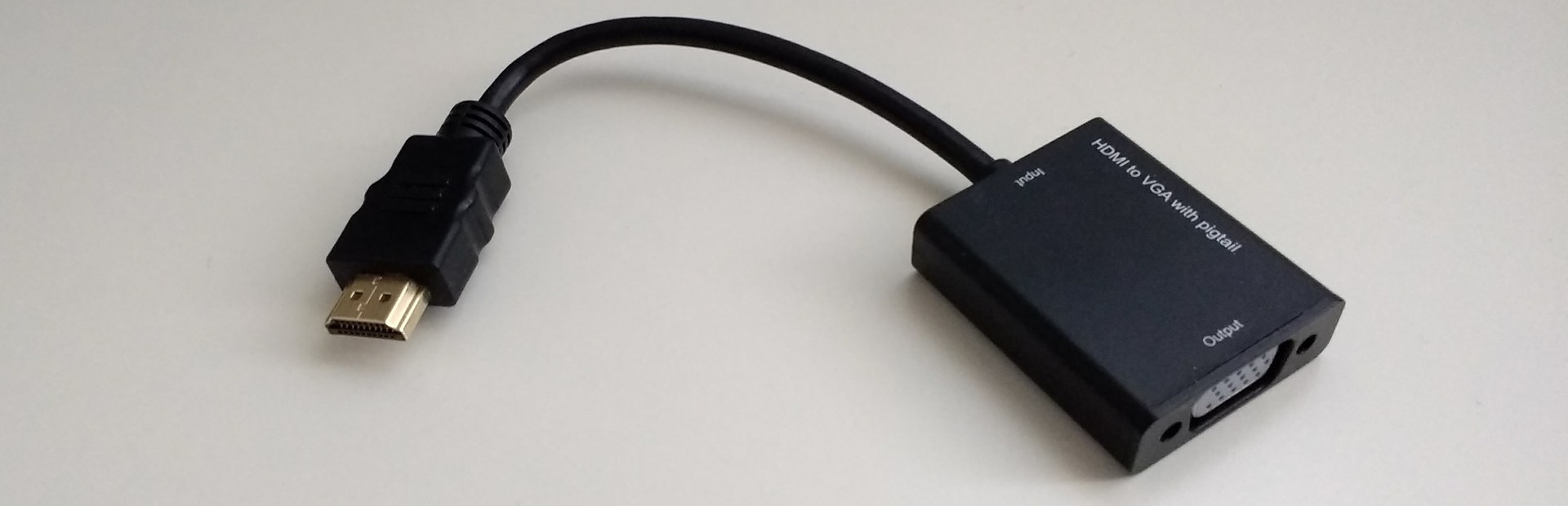
The laptop is modern and proposes only one HDMI output. If you are used to connect your laptop to video projectors (for conferences/workshop) you'll need this type of active HDMI to VGA adaptator always on your bag.
The black aluminum case looks gorgeous, but also really attract quickly fingerprints and dust. I don't consider it as a disadvantage as it force me to maintain the laptop clean when I travel.
LED:
The LED indicator for charging/power/wi-fi are on top of the keyboard; So if you fold the laptop, it's hard to see if it's charging or not. But I appreciate at the same time when I'm traveling the possibility to fold it and not be bothered by colored LED in the dark.

Conclusion
The Librem13 already has this charisma of a collectible-hardware; especially because it screams "made for GNU/Linux, privacy and freedom" from every aspect. This speaks hard to my heart of libre geek. But for my heart of artist, it is just a OK laptop: nothing less, nothing more. You can paint reasonably sized document on it, you can profile the monitor to get a 85% of sRGB. Nothing really special on this side except it works well: the Intel GPU driver collaborate well with Krita's openGL canvas and the two core / four threads CPU renders the stroke pretty quickly. All in all, I really like my Librem13 as my travel/conference laptop: I can still color artwork with it when I'm not at home, trigger the renderfarm of Pepper&Carrot and do all the task I can do with my workstation. I also appreciate how peaceful it is to reinstall a GNU/Linux distro on it, the silence and the design. So yes, this laptop is good for digital painting on GNU/Linux, without super performances -sure- , but good... and stylish!
Thanks again Purism (especially François Téchéné -creative director- and Todd Weaver -Founder, CEO- ) for the help after the burglary of my house; it quickly helped me to recover my tools and move forward for Pepper&Carrot conferences and digital painting workshop with this hardware. I hope you had pleasure to read this review on my blog; if you have more question about it or suggestion, feel free to leave a comment bellow.
External links:
- Purism website
- Librem13 page