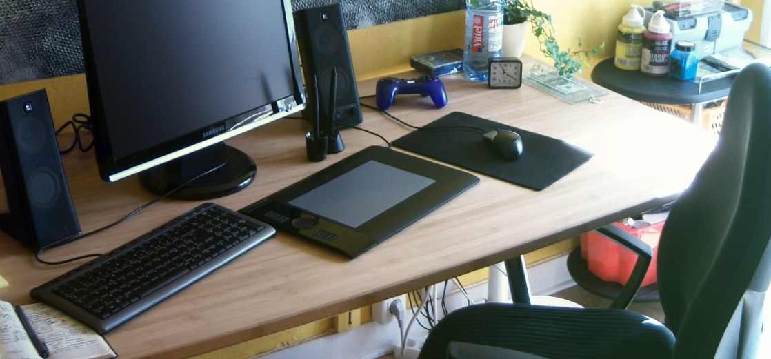
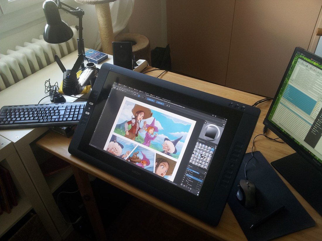
Screenshot gallery :
Here are screenshots of my system. Click on them if you need to watch full size.

Nemo file manager with *.kra file preview (top-left), Compiled Krita 3.0 (bottom-right)

Eyes of Gnome 3.18 (top-left), Screenfetch with system infos and theme (bottom-left), Cinnamon's Wacom GUI panel (top-right), color tool (center)

Video tools: Kdenlive (top-left) and SimpleScreenRecorder (bottom-right)

Blender and the Cinnamon menu

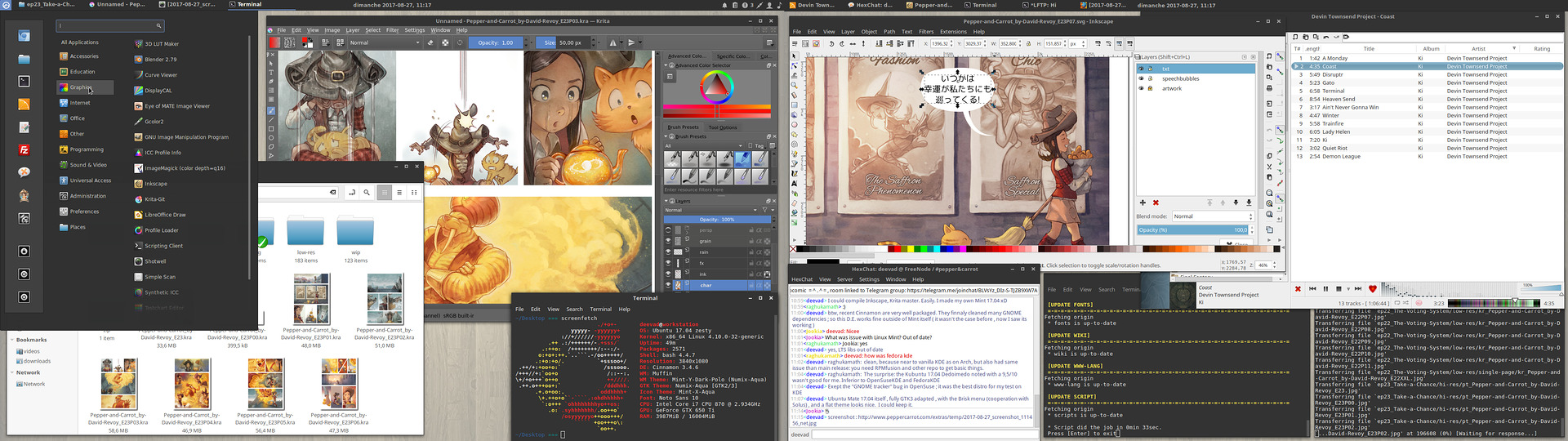
Tools I'm using for Pepper&Carrot: Nemo with RabbitCVS plugin to get a GUI for Git (top), Inkscape for speechbubble and dialog, and Git in terminal.

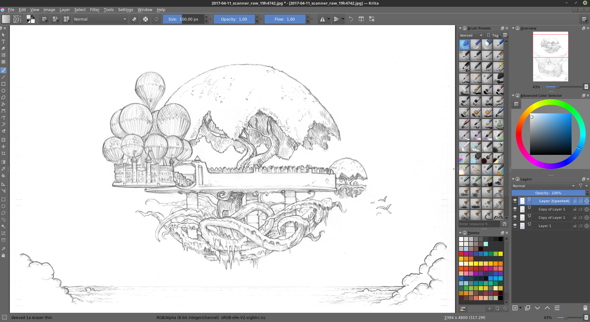
Pepper&Carrot bash scripts: installer, renderfarm and minimal GUI menu

Working on the website with Geany and a webrowser and Gcolor2 as a color wheel.
General install advice
I usually create 3 partitions :
- A small one for swap ; two time the size of my RAM is ok. In doubt, I create one of minimum 8GB.
- A 25GB minimum partition formated as EXT4 for the Linux system. ( Note: I'm using a full 120GB SSD disk for it )
- The last part of your disc, EXT4 , bigger, for your home. It means your documents, datas and user preferences. (Note: I'm using a 250GB disk for this. )
If you come from a Mac/Windows or another GNU/Linux system; You'll find all you need to know here on the official Download page for the Ubuntu desktop. Read the guide and launch your installation media.
While installing be sure you checked the support of proprietary format , and also update while installing.
It's two checkbox on the install process, inviting to download update while installing, and use mp3/flash proprietary technologies.
When it ask for the destination disc to install Ubuntu, select the last option to make a custom choice of partition :
- Our small 8GB partition use 'Swap'
- Our 25GB partition for system need to be formated as Ext4 and mount the root ' / '
- The last part , bigger, for our documents as Ext4 to use ' /home/ '
First start-up
Upgrade:
When the install process is over, and you first login into your new installed Ubuntu 16.04; launch a terminal from the menu ( or press <ctrl><alt>+T ) and upgrade the system. Here under is a line of code to copy/paste on the terminal. To copy <ctrl>+C , to paste in a terminal it's a bit more complex <ctrl><shift>+V
sudo apt-get update
sudo apt-get dist-upgrade
Additional driver:
Launch in your menu the "Addtional driver" to check if your graphic card, CPU or other hardware don't propose a proprietary driver.
If they do, it can be a good idea to test if the hardware is faster with it. For my Nvidia gfx-card, the gain of performance and stability is better with the proprietary driver, I use the last nvidia-update proposed. ( Note: restart your system after this )
Desktop environment choice:
On the top of a fresh install you can install as many desktop environment as you want. The big one already have *.iso ready-made : Kubuntu for KDE/plasma5 ; Xubuntu for XFCE ; Lubuntu for LXDE... etc... This spins contain mostly a set of packages recommended to run with the desktop-environment and a bit of branding. My own choice is the Cinnamon desktop with a panel on top, and clock centered to look like the GNOME desktop.
sudo apt install cinnamon cinnamon-desktop-environment
To switch desktop, log-out , at login screen, click on your name and next to it on the corner, click on the Ubuntu logo ; you'll be able to choose from here the dekstop environment you want to use. Switch to Cinnamon. Then login with name and password.
Get back the control of yourAlt key for Blender and Krita
Launch the System Settings panel - >Windows -> Behavior (tab)
for 'Special key to move and resize windows ( use <Super> )
also; remove the 'Attach dialog windows to the parent ; it's annoying in digital painting software.
Synaptic for a better package manager :
Synaptic is a bit ugly, it looks like a big database of all package available.
But it is quick, and with a little tweak it can have a powerfull search field to navigate the packages.
I also install gdebi, it opens the *.deb packages with a double-click on it and display a lot of information on the package before installing.
sudo apt install synaptic gdebi
sudo apt install apt-xapian-index
sudo update-apt-xapian-index -vf
( run last line twice )
(source: http://ubuntuforums.org/showthread.php?t=1178974 )
sudo dpkg -r --force-depends gnome-screensaver
Color profile:
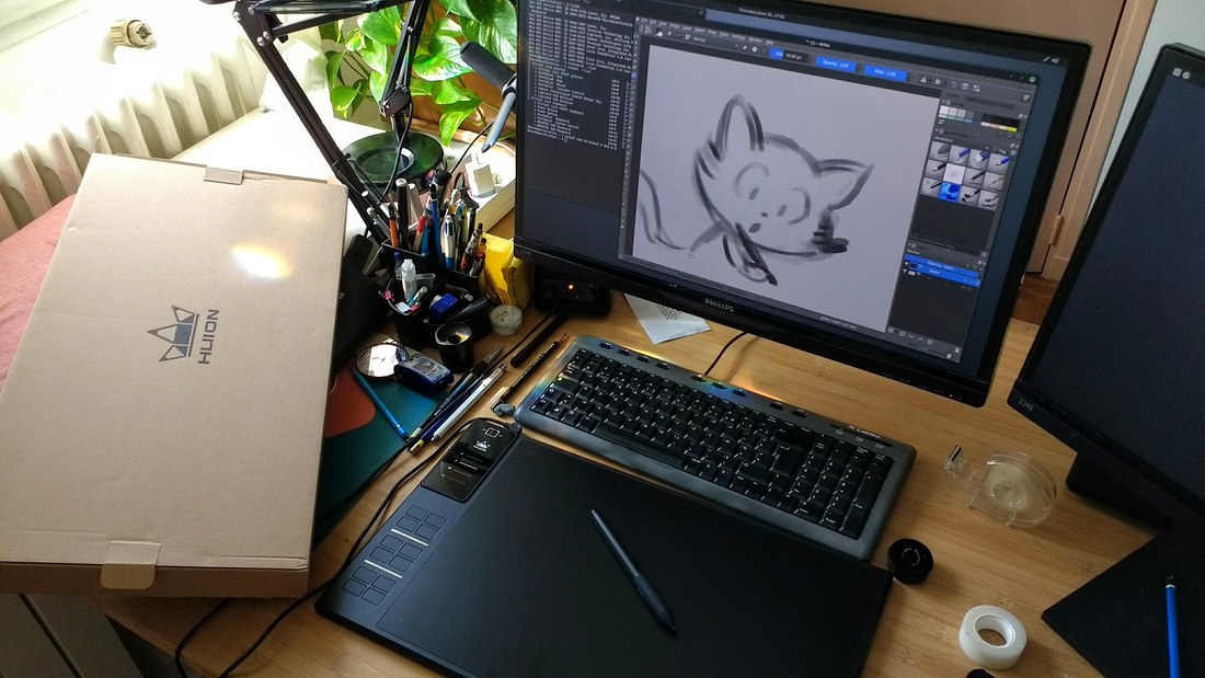
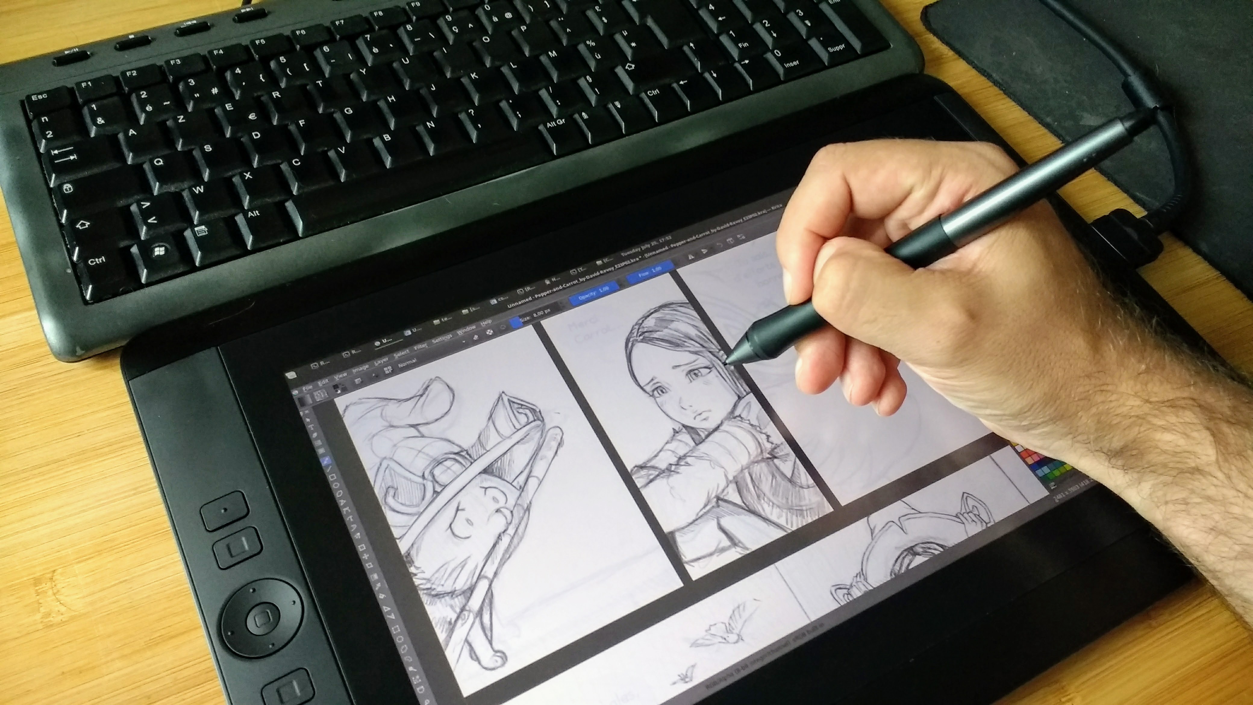
Wacom tablet:
xsetwacom --list
Wacom Intuos3 9x12 Pen stylus   id: 11type: STYLUS
Wacom Intuos3 9x12 Pad pad      id: 12type: PAD
Wacom Intuos3 9x12 Pen eraser   id: 15type: ERASER
Wacom Intuos3 9x12 Pen cursor   id: 16type: CURSOR
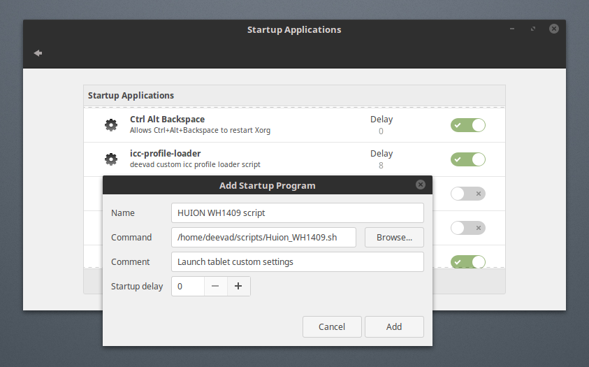
Open the file manager (Nemo) , and in the folder of your choice ( I use /home/deevad/Script on my installation ) create a new empty file with right-click , "create a new document">"Empty document". Name it tablet.sh , then open it with a text-editor (Gedit). Inside it write a script like this with your tablet name:
#! /bin/bash
xsetwacom set "Wacom Intuos3 9x12 Pad pad" Button 1 "key Shift_L"
xsetwacom set "Wacom Intuos3 9x12 Pad pad" Button 2 "key Control_L"
xsetwacom set "Wacom Intuos3 9x12 Pen stylus" Button 2 "key ctrl"
# ---------
# |   | 1 |
# | 3 |---|
# |   | 2 |
# |-------|
# |   8   |
# ---------
Full featured Nemo filemanager :
I prefer Nemo filemanager, it's often proposed with the Cinnamon desktop.sudo add-apt-repository ppa:webupd8team/nemo sudo apt update sudo apt install nemo nemo-fileroller nemo-rabbitvcs nemo-share nemo-emblemsThis is in case you meet issue with default Cinnamon/Nemo package, just fix package, and relaunch.
sudo apt-get -f installTo set nemo as default filemanager
xdg-mime default nemo.desktop inode/directory application/x-gnome-saved-searchFolder colored:
To add the 'folder-color' feature to Nemo :
sudo add-apt-repository ppa:costales/folder-color
sudo apt update
sudo apt install folder-color-nemo nemo -q
Just right click on a folder and share it, the service will auto-install everything and prompt you for a restart.
Here is a quick thumbnailers for ora, kra, xcf, psd files:
sudo add-apt-repository ppa:mmolch
sudo apt update
sudo apt install mmolch-thumbnailers
(source: http://moritzmolch.com/1749 )
(source2: http://www.webupd8.org/2013/10/install-nemo-with-unity-patches-and.html )
(source3: http://askubuntu.com/questions/260244/make-nemo-the-default-file-browser )
(source4: http://www.webupd8.org/2015/03/nautilus-nemo-and-caja-extension-folder.html )
Applications
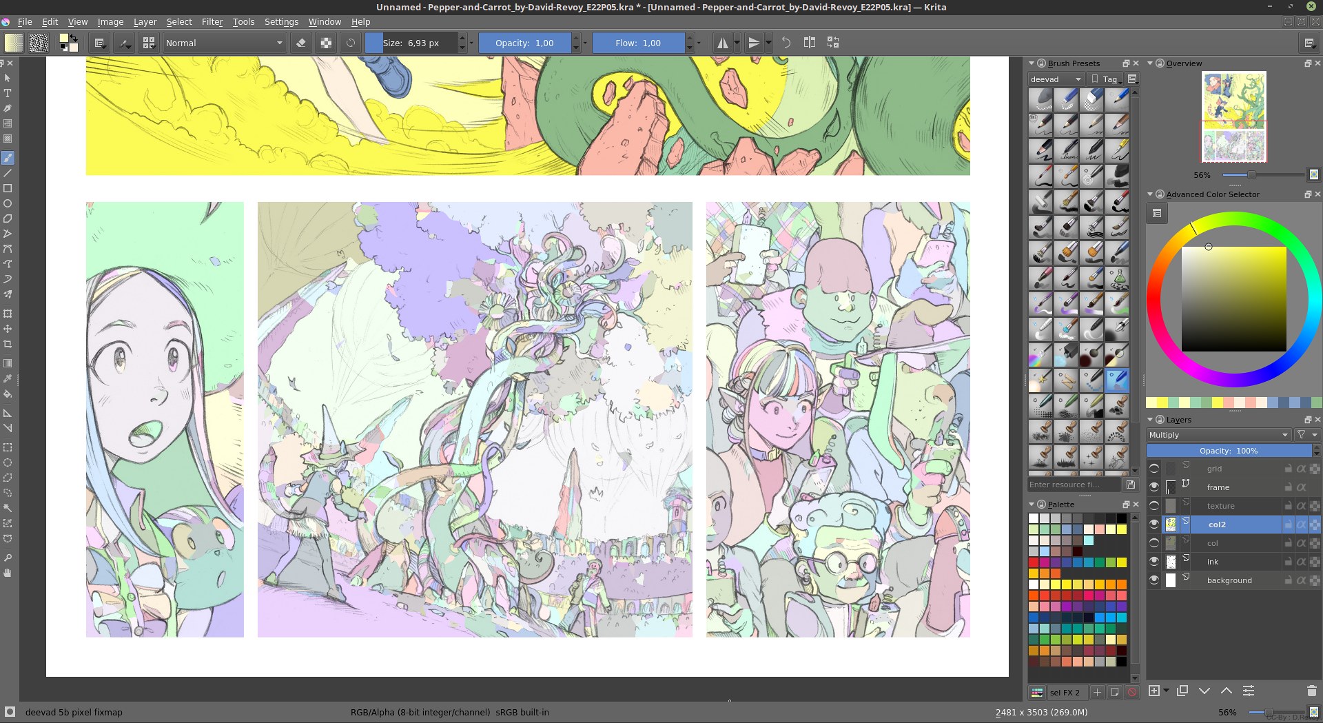
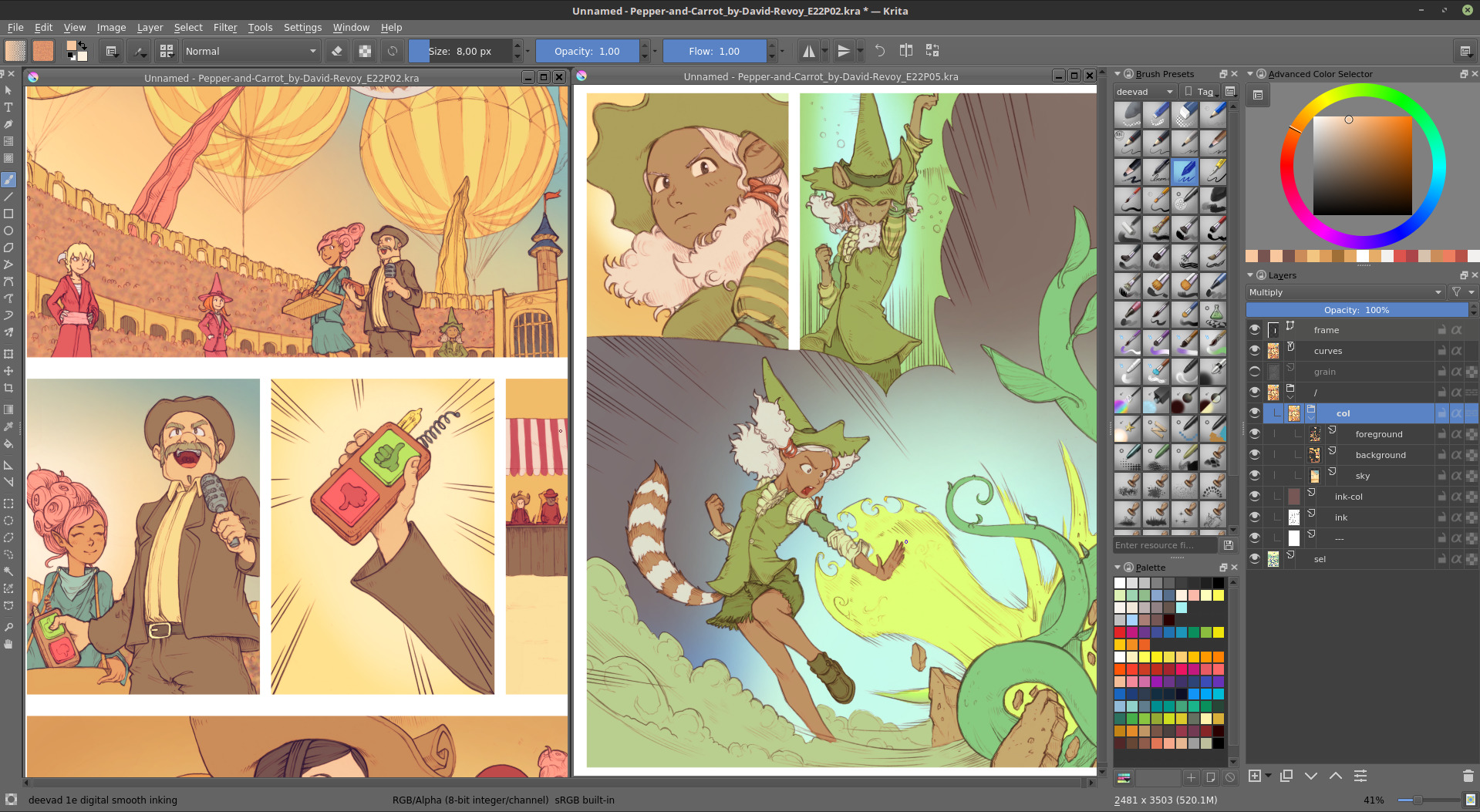
I compile Krita from sources; check the dedicated article: 'Building Krita on Linux for cats ' ; But if you want a good version easy to install, Krita 2.9.7 is on the package manager :
sudo apt install krita
Gfx tools
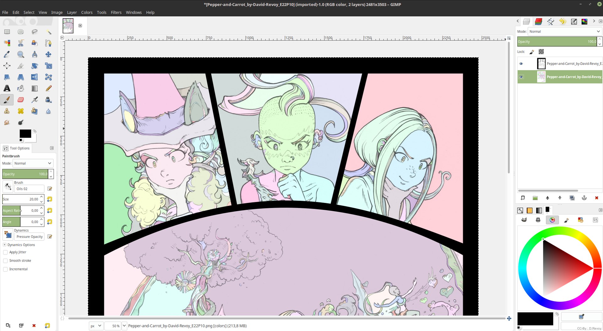
Gcolor2 is a colorpicker, Inkscape my favorite vector editor, Gimp for manipulating images and Shutter for taking advanced screenshots.
sudo apt install gcolor2 inkscape gimp shutter
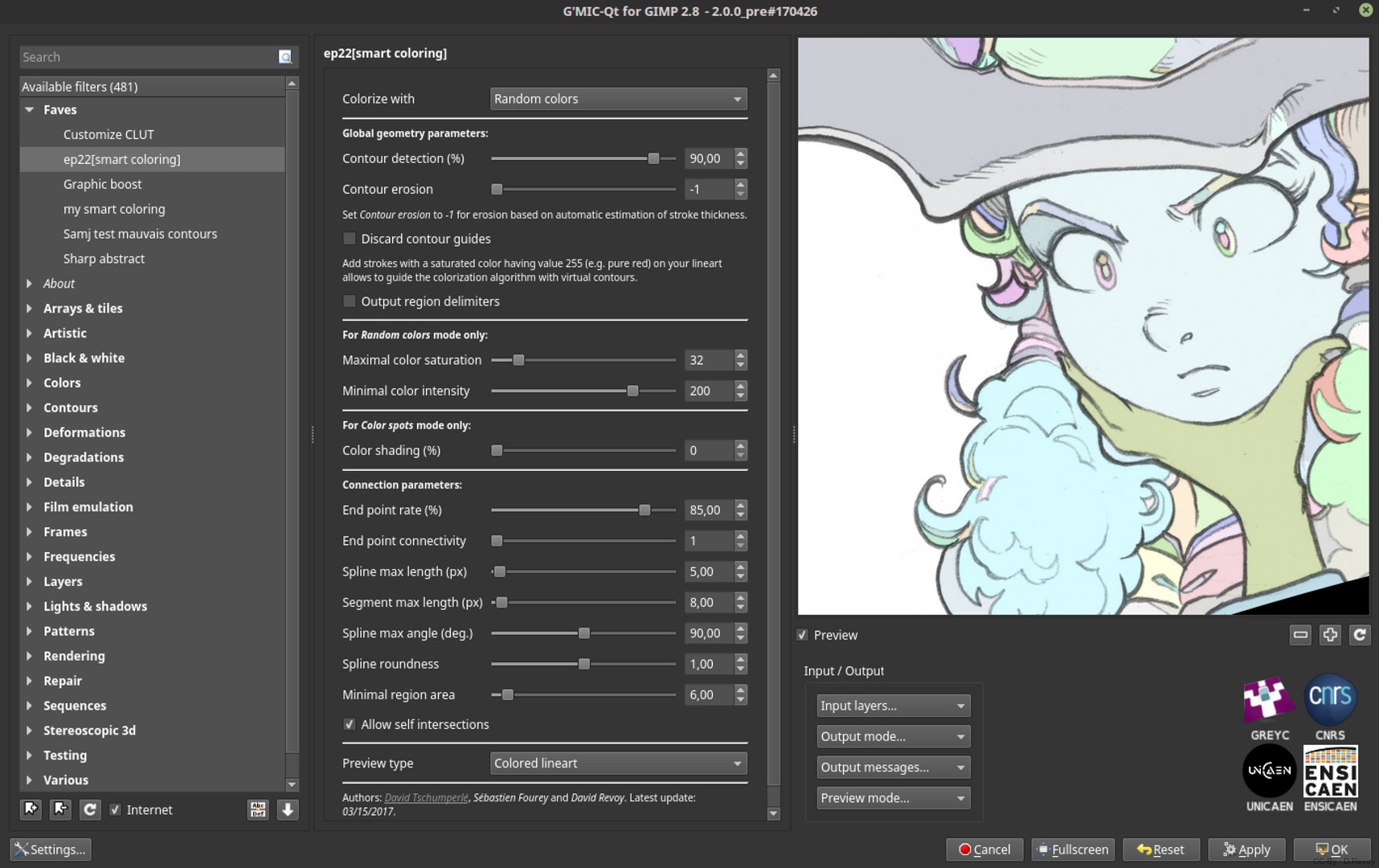
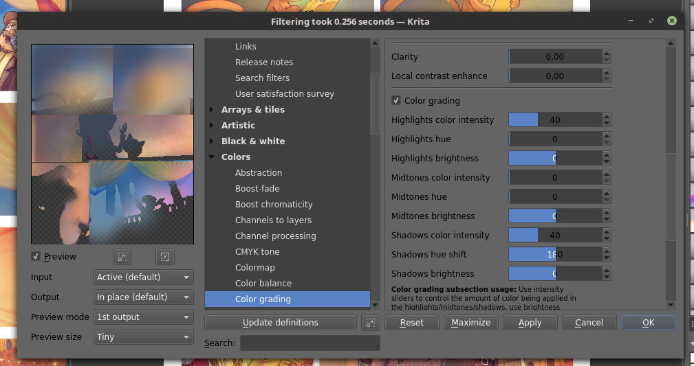
Gmic:
The plugin for Gimp and the CLI tool:
sudo add-apt-repository ppa:otto-kesselgulasch/gimp
sudo apt update
sudo apt install gmic gimp-gmicsudo add-apt-repository ppa:thomas-schiex/blender sudo apt update sudo apt install blender
Audio tools
Here is a list of classics: Clementine for playing music, audacity for audio editing...
sudo apt install clementine audacity mencoder
Video tools:
SimpleScreenrecording:
SimpleScreenrecording is the best capturing video recorder, with audio, with pause, preview, etc... the best way to screenrecord your desktop! (and I contributed to the project, so I'm proud of it :P )
sudo add-apt-repository ppa:maarten-baert/simplescreenrecorder
sudo apt update
sudo apt install simplescreenrecorder
Kdenlive:
My favorite video editing suite since 2009. I edited many Youtube videos, two DVDs and more.
sudo add-apt-repository ppa:kdenlive/kdenlive-stable
sudo apt update
sudo apt install kdenlive
Dev tools
My little development tools I use for Pepper&Carrot:
sudo apt install git-core geany wget unzip parallel diffutils grsync mc filezilla imagemagick ppa-purge exiftran lftp glipper screenfetch
Remove long notification for parralel:
parallel --bibtex
I also like the text-editor Atom, especially for the markdown color syntax highlight as I store many document in markdown:
go to https://atom.io/ , they propose the *.deb. Open this deb with gdebi to install it.
Hexchat:
For chatting on #krita freenode and #pepper&carrot ! Xchat2 is old ; Gnome-Xchat have weird interface imo ; and Polari is too young on Ubuntu repo ( can't Auth to a server, but promising Gnome app ).
sudo add-apt-repository ppa:gwendal-lebihan-dev/hexchat-stable
sudo apt update
sudo apt install hexchat
Apache and Php:
I run my website (PluXml) on a private local install before uploading them remotely to my server. Here is how I setup it:
sudo apt install apache2
echo "ServerName localhost" | sudo tee /etc/apache2/conf-available/fqdn.conf
sudo a2enconf fqdn
sudo a2enmod rewrite
Then PHP :
sudo apt install php libapache2-mod-php php-gd php-xml php-mbstring
sudo /etc/init.d/apache2 restart
Linking the localhost to a folder in my documents ( /home/deevad/peppercarrot/www ) change it to your taste! easier to work and do backup:
sudo rm -r /var/www/html
sudo ln -s /home/deevad/peppercarrot/www /var/www/html
sudo gedit /etc/apache2/sites-available/000-default.conf
add the following to the end of the file :
<Directory "/var/www/html">
  AllowOverride All</Directory>
then:
sudo service apache2 restart
Other:
Amazon link:
A one liner to clean the Amazon link in the main menu
sudo rm /usr/share/applications/ubuntu-amazon-default.desktopNote for nicer custom icons on Favorite launcher ( in activities ) :
Some icons looks really bad and this is a issue when Unity launcher display them like jewels on the side of your screen. Some are so ugly, it should be considered as bug :P I think in my number one of horrors : Zim, Hexchat, gcolor2 ... If you want to replace their icons, it's possible :
1) Go to /usr/share/applications with Files and locate the launcher of your application. Copy it.
2) Paste the launcher in your home/<username>/.local/share/applications ( Ctrl+H to unhide the folder starting with a dot )
3) Right click on the launcher, then propriety, and set permission to executable ( Allow executing file as program ) and accept.
4) Right click again on the launcher , then propriety, and click now on the icon slot.
5) You can browse to the new icons you saved on your disk, *.png or *.svg works fine.
6) restart or logout.
You have other tips? Do you need help? Use the comments; I'll do my best to answer :)


 Screenshot of the filter in GMIC